Showing posts with label negative space. Show all posts

Rocketship

>> Thursday, February 20, 2014


This one is a longtime time coming. It started as a honeybun and became a rocketship over many many months. At first I thought I would make a huge chevron sort of thing or maybe some dramatic diagonals. I didn't really have a plan, just a desire to make a baby quilt and use this Hello Betty honeybun that, frankly, was shedding the edges of its 1.5" strips all over my other fabric.

That Y-seam provided an unexpected learning opportunity. Which is to say, I had never sewn such a seam before and thought it quite intimidating. (This is, of course, the result of not planning out the quilt ahead of time, because that Y-seam is actually quite avoidable, but I digress). Luckily, the Ann Arbor Modern Quilt Guild is full of really smart sewers and kind teachers; Ginia very patiently helped me figure this out. Because when you're going to sew a Y-seam for the first time, it's not actually advisable to do one with huge pieces of fabric and lots of bias edges. But challenges: I like them? I like them.

I started quilting with the 1/4" echo quilting. It was great for stabilizing the quilt. However, if I'm being honest, it also became tedious and tiresome rather fast. After 4 hours, I needed a new plan, because I did want to finish this quilt. Hence the stippling which, as home quilting goes, is usually quick (relatively) and manageable. In hindsight, I think some flame quilting in the negative space (Kona natural) would have been cool but since I just thought of that now, it was not meant to be.

Bound with more Kona natural and sent to California: rocketship is out and about.

Read more...

Point the Way

>> Thursday, February 13, 2014


This was a giant paper-piecing experiment designed around those little slivers of Marimekko fabric. I'd been hanging on to the delightfully silver neutral stripe print for a whole now, and never found fabrics I felt worked with it. In challenging myself to use it, I decided to focus on the colors it included: silver, cream, beige, purple. Without a lot of the fabric to use, I wanted a bold, minimalist design. So I made myself some paper templates (good way to use up 12" scrapbook paper that's lingered in my art supply collection for years) and got to work. The quilt consists of 8 pieced blocks and 4 solid blocks).


Paper-piecing produces pretty perfect points. I made some freezer paper templates of each of the 5 shapes -- the center (1) and edge triangles (2) as well as the slivers (2) to help with cut with minimal waste and avoid almost-but-not-quite-covering a piece of the template (which still happened...but only once...and in a very fixable way). When it came time to quilt, I got a little adventurous and used different thread and different quilting patterns for each fabric. The silver squiggle is my favorite.

For the first time in a while, I went for a super simple non-pieced back. I had just the right amount of this fun, squawking bird print (picked up at Ikea, a few years back), and it added some pattern-y goodness to the minimalist front. A sweet grey binding later, and the quilt was done.

Well, almost done. After I washed, dried, and took these pictures, I noticed that one of the purple seams had come partially undone. This was really weird, since it was a full 1/4" seam and I've never had that happen before (partial lie: it happened with imperfect 1/4" seams when I was a newbie quilter). A little steam-a-seam and a few repair stitches later, and the quilt flew off to Connecticut where it resides with young William (and Cynthia and Andy).

Read more...

A Midweek Peek

>> Wednesday, January 22, 2014


A Confession: as a somewhat lazy laundress, I often find that an imminent need to do laundry offers an incentive to finish a quilt. Otherwise, it might take a while for that quilt to get all soft and crumbly from the washer/dryer rumble.

The blocks above emerged from a desire to use the neutral striped Marimekko print, of which I had some but not a lot, and for which I was uncertain about coordinating colors. So it's a very neutral quilt. Not my usual color scheme, but a pleasant experiment with paper-piecing (of my own devising, though perhaps there are comparable blocks out there in pattern-land).

The quilt is ready to send off to its new owner. But I need to take pictures, and this -3 nonsense to which I awoke this morning (cozy under flannel sheets, several quilts, and a down comforter) has not exactly inspired a photo shoot. According to my weather app, it's 10 degrees warmer now, at a whopping 7, which might be sufficient enough for some whole-quilt shots outside.

Read more...

The Baby at the Bachelor Party

>> Thursday, January 16, 2014

{I'm taking this opportunity to do a little #latergram style blogging. This post is brought to you by August 2013...}

Apparently not everyone has gender-inclusive bachelor parties, complete with the attendance of a baby (neither mine nor the bachelor's, for the record). At least, that's what Jenny and I gleaned when we served as chief participants in Joel's bachelor weekend. We got a lot of odd looks when we told people what we were doing. Which mostly involved gallivanting in a park, eating really good food, imbibing delicious drinks, going to a spa, attending live theatre, eating amazing cookies, and hanging out.

Did I mention the cookies? They're amazing.

I took this opportunity to multi-task and give Elody her baby quilt. Improvisationally-pieced with (mostly) Modern Meadow prints plus a little magenta and yellow for pizazz, this quilt came together quickly over a couple days. Lots of vertical movement and negative space, just how I like my quilts.

And Elody seemed pretty content as well, even as we wrapped her and unwrapped her for our high-class on-the-couch photo shoot. The back has 2 prints, both with lots of blues and purples. It's all straight-line quilting, at random intervals. I can't really remember why I chose to quilt it like that, but I like it.

Read more...

Windmill

>> Thursday, August 8, 2013


I have learned many things this summer, including the fact that mental blogging does not, it turns out, translate into actual blogging. Thus I have a bit of a blogging backlog to address--which is to say, to actually blog, rather than contemplate blogging while running, showering, doing dishes, walking dogs, or any other sundry activities. First up: Windmill.


This quilt started as an experimental block initially created to use the blue/green stripe (a Marimekko/Crate & Barrel outlet print). I had a vision for the block -- and the eventual quilt -- but plunged into sewing before I figured out the best way to make the block. The best way is not to paper piece the half-square-triangle-with-stripe and add a border, for, as the above image indicates, it's very hard to line up correctly. Had I paused and drafted a paper-pieced design for the whole block, well, that would have been smarter. But I didn't, at which point the block design changed to fit what I had and what precision I could handle.


Semi-bordered squares: perhaps they suggest motion more than stasis? Let's go with that line of argument. When my friends Ethan and Hagit had a baby this spring, I decided I should finish up this quilt top and send it off to Cincinnati, where they've graciously offered me meals and more when I was there for research last year.


At which point I realized I could use some fun Ed Emberley prints (dogs & frogs) for the back, and plucked some other coordinating prints from my stash. The quilting appears a little more clearly on the back -- I used elongated squiggles in the spokes of the windmill and stippling throughout the rest of the quilt. The thread became unintentionally variegated as the two spools of deep blue were not, as it turns out, exactly the same. But I'm cool with variation and impatient with shopping, so a mixture of blues turned out to serve my needs perfectly. I'm banking on Daniel not noticing for a long while, if ever...

Read more...

Diamond Derby

>> Thursday, April 25, 2013


It snowed--snowed!--here yesterday. Grrr. But that reminded me that I last took pictures of a quilt in the snow. Thankfully, that snow was in February, where snow belongs.
I started playing with diamonds in December, sketching out a few different options. Just because. I didn't know who would get this quilt, and just felt the urge to play a bit. The final sketch became the plan, albeit one that swerved when sewing the blocks together. I forgot where I had placed the blue block, but I don't think that slight switch mattered much.


A lot of my favorite oranges and aquas leapt from the scrap bin into this quilt (they're very active, those scraps). In an attempt to keep the strips straight, I paper-pieced the diamonds. This turned out to be handy less for the strips and more for the background as I had very little charcoal painter's canvas to spare and needed to piece together scraps which were easier to handle when paper-pieced.

The back: some fun black and white and aqua and orange prints. I used straight-line quilting, some vaguely standardized distance apart. Maybe an inch? It's hard to recall such details from February which is perhaps why I should have posted this earlier. Oh well, should you seek to emulate it, pick a distance and enjoy! One of the best parts of finishing Diamond Derby (which I just named now, should you have momentarily wondered) was that I got to give it to Yasmeen (or, really, her awesome parents) in person. The post office usually delivers quilts for me, which is a nice service and all, but it's way more fun to watch people unfold quilts.

Read more...

Crunch Time

>> Sunday, March 24, 2013


When I was in college (in the olden days), the dining halls had a bread table, and on the bread table sat a box of matzah -- presumably left over from Passover and set out until consumed. During my first year, I learned that there were people who actually liked matzah. This was a revelation, as I could not fathom how one could enjoy the taste of cardboard. It turns out that when one does not eat it for 8 days every spring, one can like it. I mean, it still boggles my mind, as I limit my matzah consumption to small amounts on Passover, but still, there's something in there for the psychologists to think about.


A friend recently enlisted my help in a gift project, and to help her, I realized I needed to figure out how to piece certain Hebrew letters, notably the tzadik (above). Rather than make a lonely letter, I decided to make a word -- matzah -- and then make it into a matzah cover. This was timely, since Passover starts tomorrow night. I kept things simple and made white letters and used a blue/green ombre fabric (Marimekko scraps). I wanted the quilting to evoke matzah (which is sort of grid-like in appearance) without sewing over the letters. I tried out some straight-edge free-motion quilting which, I learned, is harder than curvy free-motion work. Or maybe I just need more practice. I like the effect, imperfectly sharp lines and all.


I dug into my scrap bin for the back and played around with some improv curves. I think I might make a bigger quilt with curvy columns. Usually I choose my binding to make a quilt pop, but this time I decided to emphasize the ombre fabric and use it to bind the quilt. It blends along some edges and pops along others. I like it.

Read more...

A Little Garnish

>> Tuesday, March 5, 2013


Frozen snow adorns the landscape. Lest you think this is a good thing, it is not. It's icy, rigid, and ugly. Also, it's March, and this sort of stubborn snow seems unnecessary. It's time for spring, mud and all. I assume that's why I've developed a regular hankering for radishes. They're sprightly and crunchy and colorful, and the big log pink and green log cabin in the middle of snowy white cotton sort of reminds me of them.


The resemblance is obvious, no? This square started as an scrap-busting coaster project, until I realized I don't really like making fabric coasters. They're small, kind of annoying, and the ratio of time spent to fulfillment is terribly low. So I abandoned that plan, and made a baby quilt instead. One big block, lots of negative space, and some delicate loop quilting, and the ratio of time spent to fulfillment was so much better. I've also developed an appreciation for chartreuse. It's not a color I particularly love or to which I gravitate, but I like it with these bright pinks -- or with turquoise and navy.


This photo session -- which admittedly transpired in January or possibly even late December -- produced an abysmal array of images of the quilt back. Most of them were blurry -- and not in an artsy, fun, instagrammy sort of way. Nevertheless, I'd been looking for the perfect project for this Erin McMorris Wildwood print. It seemed best used as a large slab but pink/grey/chartreuse is not a color combination I'm accustomed to using; thus it sat on the shelf under consideration for several years before nabbing a spot on the back of this quilt. A little light green binding later, the quilt was done and shipped off to northern California where winter is sort of like spring in Michigan.

Read more...

Into the Emerald Woods

>> Tuesday, February 12, 2013


Way back when, in the fall, when there were still yellow leaves dancing in the trees and fluttering on the ground, I had this idea for a quilt series: monochromatic, two-tone, shape-focused quilts. I made one, pulled the fabric for a second, and got stymied for time. But perhaps it will be a series developed over many months, a yearly touchstone of Two Hippos designs. Or it will stay in my head. Which is fine too.

The front yard is currently brown with specks of old snow, maybe even a few remnant piles of white glory. But every fall it gets coated in brilliant yellow, providing the perfect backdrop for a very green quilt (pre-washing -- had to take advantage of the color). For the record, I made this before Pantone selected Emerald as the color of the year, but obviously they read my mind. The particular greens came from my unlabeled stash which means I cannot tell you where to find them. I sort of think one of them was from P&B textiles, but that's all I got. The binding was Moda Orange, I know that.

It started with the medium chevrons, pieced from 5" squares turned into HSTS sewn together into chevrons. At one point, it was all chevrons plus negative space. I liked it but didn't love it. Also, it was a touch small and I was out of the darker green fabric (a regular issue when one quilts from stash and does not plan ahead of time -- it's more fun this way, I promise).

In a quest for movement, I added the line (cue first week of 9th grade geometry and lessons on points and lines. I mostly remember the teacher talking about dots as points and points as lines, beyond that I much preferred algebra to geometry). I considered upping the green quotient with some bright lime, but I held tight to my two-toned vision.

Until the binding, when I auditioned several more greens and, on a lark, some orange. It needed orange. But before I bound, I quilted, in irregularly spaced curvy lines. It's one of my favorite quilting methods (imprecise, fast, crinkle-inducing, and echoed the Mendocino backing fabric -- super soft stuff, that Mendocino line). It was tempting to keep this one, but it was too small for me to use (at about 36"x45") and too large to hang. Instead, it made its way to Chicago and the hands of the young Judah Oliver, whose parents, I happen to know, also adore green.

Read more...

Sebastian, Literally

>> Sunday, December 30, 2012


Barring some radical shifts in the US population's naming preferences, my name is never going to crack the top 1000 baby names, as measured by the Social Security Name Database (a fascinating dataset, for those statistically inclined or trend curious). Which I rather like. At least now -- there was the crushing childhood realization that I would never find my name plastered on magnets or keychains or the like (which my siblings could, in fact, purchase). But I've recovered from that discovery and rather enjoy possessing an unusual (in the US) name, even if it sometimes causes pronunciation consternation (in others; I know how to say my name, though some native Hebrew speakers might dispute my Americanized version) and gender confusion (theoretically this could be explained by the fact that my name in Hindi denotes a male, but somehow I don't think that's why I get emails sent to Mr...).


Sebastian, in contrast, has enjoyed a popularity curve worthy of a roller coast ride. One hundred years ago, it rested at 567, but by 1950, it fell out of the top 1000 names. A decade later, it poked its way back in, and then, for about a quarter century, toggled between the mid-700s and the mid-500s. By 1986, it started its upward climb and, at the turn of the 21st century, it jumped into the top 100. For the past 2 years, Sebastian has rested comfortably as the 68th most popular boy's name in the US. But when asked to make a quilt for a baby named Sebastian, I knew nothing of this history.


I simply knew that the baby was named for a family friend's deceased father and they wanted a quilt that reflected this meaningful name choice. I chose to be literal, and I made the name the visual centerpiece of the quilt. I paper-pieced the letters (3"x4") from templates I made (inspired by these). The "a" turned out to be my favorite, though whether that's because of the shape or the fabrics used, I'm not sure. I used blues and greens from my scrap bin and stash, and arrayed the letters on a dark-light-dark spectrum, all set against Kona Mustard.


To add some visual interest, I pieced some squares and rectangles together, and added them above Sebastian. As is my habit, I improvised as I pieced -- adding, trimming, debating, selecting, rejecting (aka seam-ripping), and adding some more. The crinkling derives from unevenly spaced straight-line quilting. The back of the quilt is Michael Miller flannel (Zoology in Sea), which is delightfully soft. Whether or not Sebastian has made its way on to magnets and keychains, but this Sebastian has at least one thing with his name labeled with his name.

Read more...

Triangulate: Complete

>> Monday, November 5, 2012


I took pictures of this quilt over a month ago, when my backyard had only a sprinkling of leaves on it. There are many silly reasons I didn't post this quilt until now--and one serious one. It turns out that transferring pictures from the camera to the computer is somewhat essential to the blogging process, and not misplacing the cord that connects said technological devices is, well, somewhat imperative. But the cord has been located, the pictures moved, and the blog (is being) updated. This process has also revealed to me that these pictures are not, shall we say, the most amazing. I think I need some new photography angles and venues, and a human helper wouldn't hurt. But for now, they will suffice.


Way back when (in March), I asked the members of do.Good Stitches: Empower to make some triangle-in-triangle blocks. I had a vague notion in my head that they would be cool, and wrote up one way to make the blocks. But I had no real plan beyond that. After fussing with a number of possible layouts on my brother's living room floor, I built the quilt around triangles and lots of Kona charcoal. And then paused while I lived sans sewing machine and pondered the quilting options.


Echoing triangles -- a term I just made up -- won the quilt pondering (who knew it was a contest?). I wanted simple and non-distracting. If I were a fancy quilter, which I am certainly not, or owned a long-arm, which I definitely do not, I could imagine filling the charcoal with awesomely intricate quilting and doing something else I haven't really figured out in the triangles. But absent radical, magical changes in my life, neither of those things were happening. And since I hope this quilt will be well-used by whomever Alternatives for Girls gives it to, I wanted it to remain soft, which minimal quilting helps achieve. To bind it, I used a mixture of Terrain prints in orange and pink.


This is my second-to-last quilt for do.Good Stitches, at least for now. In September, the lovely Empower ladies made fantastic neutral log cabin blocks that I'll be putting together...soonish. I've truly enjoyed getting to know the other crafty women in my group, and love the concept of do.Good Stitches -- working with a group of people to make quilts and donating them. Last year, as I was traveling to archives for dissertation research, this project was one of several things that kept me grounded and provided a certain amount of regularity in a peripatetic (I just love that word!) life. But this year, as I'm sitting down to write, I've found that feeling grounded requires fewer obligations and more flexibility. As a result, after some hard thinking and internal debating, I decided that it was time to let dGS go. I have one more quilt to wrap up, and I look forward to seeing all the incredible quilts the group continues to make, but for now, watching from the sidelines is where I need to be. 

Read more...

Orbs Away

>> Wednesday, August 22, 2012


I had plans to make a completely different quilt. But Austin was born a couple weeks early and I had a chance to hear about him before I actually made the quilt (the benefit of being behind on gift-making?). Suzi told me that Austin was intense, and vacillated between "Baby Snuggles and Baby Landlord." I wanted to make something that reflected intensity but with a little funk. Then I saw Leanne's pattern-testing post, and followed it to Julie's Mod Pop pattern introduction.


It was time to hack, modify, reverse-engineer. I wanted to make the orbs Julie used but allow them to stand out a bit more (which is also to say I wanted to take advantage of negative space and make a less busy pattern or, ahem, be a little lazy and make fewer orbs and less patchwork). My orbs are imperfect as I trimmed my drunkard's path blocks with a 3/8" edge instead of 1/4" because the piecing foot I was using created a generous 1/4" seam allowance. This was a mistake, but one I didn't realize until it was too late -- or would have required too much seam-ripping for my taste. Crafty imprecision and imperfection are rather fetching, I think, though I realize not everyone feels the same. Which is all to say that I'm not sure what Julie's instructions call for, but you can get her pattern here if you want to make her version or don't want to fiddle with sketches, graph paper, or numbers to make your own.


Besides, if you squint hard enough, the edges look perfect. Just squint harder and you'll see what I mean.    Lovely as it is, Moda Dill does not match any of the thread choices at my local Joanns. In the past, I've simply used a lighter green, but since I was at the store and needed to buy thread, I decided to make a radical move into variegated thread. That stuff is cool.


I used Moda Dill as the background color for three reasons: 1) I had a bunch of it, 2) Suzi likes green and she'll be seeing the quilt in its full color glory before Austin will recognize green as a distinct color, and 3) I really wanted to use the Alexander Henry Zoo print on the back. I've had the big and mini zoo prints in my stash for several years and they had proclaimed a need to be used (on their chatty days, obvs).


Every time my eyes focused on the elephant in the zoo print, I worried that my stippling had gone awry and there were random threads dancing across the quilt back. I don't know why the white line on the elephant was so different than the lines across the giraffe or ostrich or rhino, but it was different. Alas, it turns out my eyes were playing tricks on me. For the binding, a print from the blue/green colorway of Denyse Schmidt's Picnics and Fairgrounds line helped bring together front and back.

Read more...

Foxy

>> Sunday, August 5, 2012

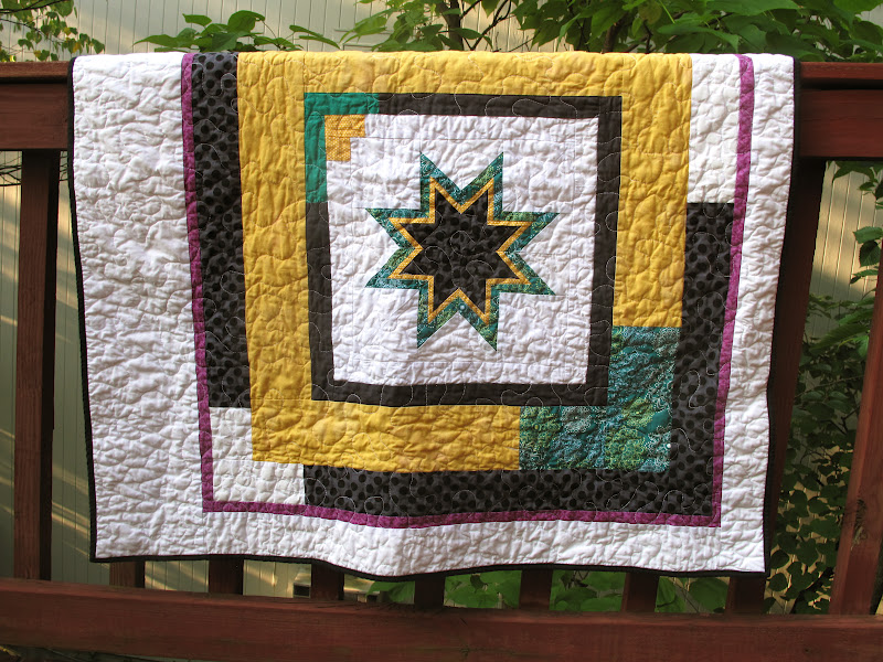
When Lizzy House's Outfoxed line came out last fall, I thought it looked fun, but I was trying to reduce fabric purchases until I got the stash under control. A few months later, when I found out my first quilty-blogland friend Michelle was pregnant with Kit, I had a good reason to buy a yard of Outfoxed. More specifically, I grabbed a yard of those clever foxes in the Outwitted (yellow/green) colorway, so I could make a gender-neutral quilt for the as-yet-to-be-gendered-or-named baby-fox-to-be.

That was the plan anyways. Despite my winter acquisition of a piece of fabric, Kit debuted with no quilt on hand, or even in my head. I had some vague ideas based on Michelle's flickr favorites (because, let's be honest, she's going to appreciate the quilt more than her child, at least for a while), but nothing really stuck. To an extent reasonable (it's true, sometimes I make up new phrases), I wanted to combine our styles. Which can be a little tricky, like a fox.

Michelle is a paper-piecing rock star, so that seemed like a good place to begin. And I'd seen these 8-pointed stars around blogland for a while; I'd even printed out the templates. Actually, I printed them twice, as my July self did not recall that my April self had already printed them. Now I can make another, I suppose. I love the outcome, but that star took several hours of an evening to master, so I applaud anyone who makes lots of them. After that evening, I knew this quilt would feature one star and one star only.

Which is where my love of asymmetry, pops of color, and negative space comes in. Because one star can make a very fine modern quilt. The purple was a last-minute addition, when the yellow/green/black/white combo seemed to lack a little pizzazz. And goodness knows, infants need pizzazz in their vision fields.

I happened to be perusing the shelves at Brenda's shop while contemplating the back. I only had a yard of Outfoxed, and the quilt grew to be a bit larger. I saw Aneela Hoey's Foxlets print and it obviously needed to join the other foxes on parade, or around the campfire.

The binding followed the design of the quilt front: mostly black, with a teal corner. Deciding what thread to use to machine-bind it posed a bit of a quandary, but in the end I opted for black. It stands out on the teal portion but disappears into black fabric. Aside from the fox fabrics, everything else came from my stash, so even Foxy, as I began to refer to it while sewing it together, contributed to stash reduction.

Read more...

  © Blogger template Autumn Leaves by Ourblogtemplates.com 2008

Back to TOP