Showing posts with label blogs that are not my own. Show all posts

Winter Star

>> Friday, January 4, 2013


Sometimes the background color is the easiest choice to make. When a friend asked me to make a quilt for her friend's new baby, she suggested something "green or maybe purple, nothing too boyish." I loved this set of color instructions. I toyed with purple and gray (a combination that often pops into my head and maybe one day will make it into a quilt), but I knew green was the way to go, and Moda Dill just felt right (and, um, I had a bunch of it. Practicality plays a role too). The question was what other fabrics to use.


My fabric stash is not wanting for greens, but a lot of them fall more on the blue-green side of the color wheel. Chartreuse, despite its current fashion popularity, rarely made me press click when I viewed it online. But lovely as my aqua-trending stash is, it just didn't feel right. Which surprised me, because I had already decided to use a purple binding, and I thought blue-greens would fit. But then it made sense: green/blue-green/purple completes the rainbow, but walks, rather than sashays, down the runway. Yellow-greens it would have to be. Loosely interpreted (that wood grain is really more yellow, than yellow-green), I settled upon 8 star-worthy choices. I'm not even sure which one is my favorite, and I thought picking a favorite would be easier with a color scheme that I buy less frequently. Except that I think less commonly acquired means more carefully selected. Fabric stashing can be tricky like that.


I shrunk Jeni's Vintage Star Quilt, making it baby, rather than giant, sized. By baby-sized, I mean about 40" square. The 10" piece of Seedpod, with its perfectly matching dark green and wonderfully coordinating yellows, oranges, and light greens, determined the size of the star. That is, I made big HST blocks with 10" squares (9.5" trimmed), which yielded a 36" star. I wanted it to float, so I added 2.5" green borders on all sides.


If there's one animal that predominates in my fabric collection, it's birds. Which is a little funny since I know very little about said creatures. I might be able to identify a robin and a raven, but there my ornithological knowledge ends. When rendered in two-dimensions, however, Joel Dewberry's birds stand apart from Paula Prass' and Laurie Wisbrun's separate from Valorie Wells. Thus the backing brought together a yard of nesting birds with a wide strip of flying ones. Free-motion stippling--with variegated green thread on the front and white thread on the back--holds it all together. Finally, purple edged its way into the binding -- a beautiful Marimekko purple print I picked up over the summer at the Crate & Barrel outlet.

Read more...

A Little Spice

>> Thursday, December 27, 2012


Sometimes the closet provides the perfect upcycled wrapping. Because a warm, flannel-backed quilt might just save you 10 percent on your heating bills this winter. I finished this quilt right before I went home for Thanksgiving, and I wanted to make sure it stayed protected in transit. That, and I needed to deliver it to the person who commissioned it as a wedding gift, and I thought she'd enjoy the temporary wrapping.


I showed a few glimpses of the quilt in progress way back when I started it. As noted then, the design is based on Felicity's lovely Sea Glass on Sand, and based on her (and other feedback) I added in a couple of mulberry triangles to pop against the browns, greens, and creams. The colors, along with the seasonal scents they evoke and the occasion for the quilt, led me to dub it "A Little Spice" as I constructed it; the name stuck. The color scheme is a little different from my typical choices, but it was designed for the couple whose apartment is decorated in creams with green and brown accents. Working out of my color comfort zone pushed me to think about design, and how a quilt could sing in a more muted palette.


I love how the bright white draws the eye in as much as the greens and darker tans. The blocks were all 6" and I originally planned a 10x12 layout, I added an extra row to make it 10x13 (or 55"x71.5") as I pieced it together. The seam allowance ate up the 1/2" between rows and while I knew that would happen, I felt a need to compensate. Or at least make sure there would be room for the couple's toes. I borrowed the quilting plan from Felicity as well, using 2 interlocking curves on the diagonal -- a technique I'll certainly use again.


The quilt commission came with a request for a "soft back," and I opted for flannel. A flannel sheet from Target to be specific. The sheet is thicker than quilting flannel, so that plus a layer of batting makes for a substantial throw quilt. Using a sheet also eliminated the need to piece the back and, as it was bigger than the front, simplified basting as well. The binding is a Heather Ross print, Meadow Flowers, I picked up in the sale vault at Lake Street Mercantile about 4 years ago. Apparently I could have sold that yard for about $36 right now (admittedly, it's no goldfish), but I'm content to let aesthetic value trump financial gain. Plus, if someone had purchased it, I would have had to go to the post office between Thanksgiving and Christmas, and that surely represents a terrible use of time.

Read more...

Step-by-Step

>> Tuesday, October 23, 2012


120 6.5" squares waiting to be turned into a quilt. A commissioned wedding quilt for a couple getting married in December. The instructions were wonderfully simple: come up with a quilt for a couple whose apartment has a cream/brown/green color scheme. I toyed with several ideas for the quilt, mostly thinking about wide improv pieced curves, a larger version of this challah cover in a different color scheme. But then I saw Felicity's Sea Glass on Sand quilt, I quickly formed a new plan.


I dug into my collection of solid neutrals, added a few more from my (local) quilt shop Pink Castle Fabrics, and started cutting. Moda Snow dominates, as I had some yardage of it, but the pile also includes Moda Porcelain, Kona Snow/Putty/Oyster/Parchment, Fig Tree Cream, and unlabeled neutrals from my scrap bin. I had more shades of green and fewer shades of brown than I expected (or realized). But a sufficient spread to keep the corners interesting. I considered mixing in some prints, but I like the look of all solids.

I'm still considering adding in a few punch of mulberry (shot cotton, that is). I plucked three squares from the pile before trimming so I can play with the layout and change my mind, rip out some seams, and insert a few dots of difference. I usually dread trimming and squaring blocks. But a few episodes of Dexter (I'm still on Season 5) made the work less tedious. The blocks are trimmed and ready for my design floor. Once I sweep and vacuum said floor, anyways.

p.s. In anticipation of Pink Castle Fabrics' move into a new brick and mortar space, everything in the shop is 25% off through the end of October, with the code MOVING. Depending on when you place your order, I might just get the chance to cut and package it for you.

Read more...

I Made A Dress!

>> Sunday, September 2, 2012

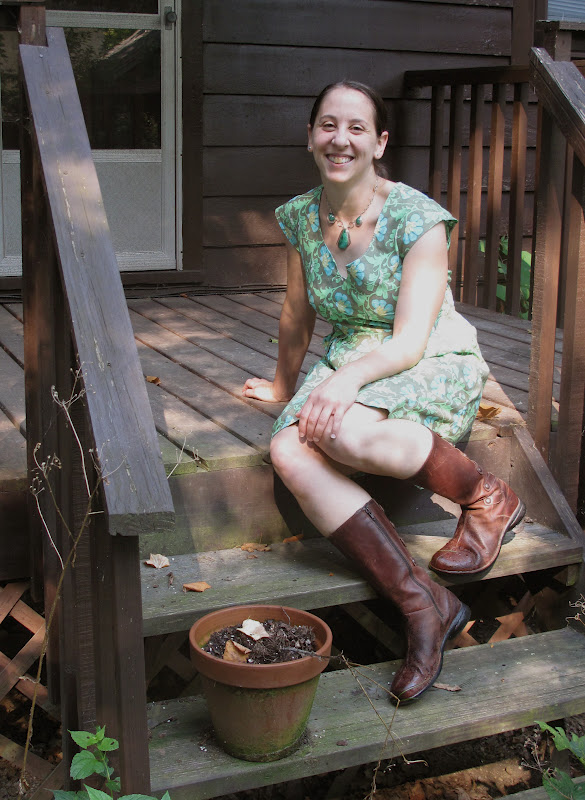
I'm no longer sure whether sewing garments or photographing garments which one has sewn is more difficult. Both are tricky. The instagram/mirror option above does the job, provided no one looks too closely at the state of my mirror. (It's hidden in the closet, who needs a sparkling clean mirror in their closet?)

I finished this Washi dress over 2 weeks ago and have worn it well, let's just say a lot, since then. But I didn't post about it because I needed more pictures, which required enlisting a friend to play fashion photographer. And fashion photography, it turns out, is hard. Hard for the photographer and hard for the model. You know how even catalog models look like they're just going about their day, looking at the pretty sunset or petting a nice horse (who does that wearing a nice dress? Catalog models, that's who) or laughing at what must have been a hilarious joke. That's not easy to replicate. I look absurd doing all of those things (especially petting a horse, since the horse was invisible ).

Now about this dress. First, it is awesome. And not just because I made it. I made a dress! (Got that?) It's awesome because it is super comfortable, can be worn with boots (even if it's 88 degrees during said photo shoot, the boots were key), and has pockets. Pockets. All dresses should have pockets.

Second, it's not all that hard to make. Let's be clear: I make quilts. Occasionally I make bags. I have never once sewn a garment. Wait, that's a lie. I once made a pair of "pants" for a Tempest-themed Halloween costume (I was Ariel, my friend was Caliban, we were nerds, it was great). But basically, I have never made a garment or at least one that needed to last more than one night and fit. Which this delightful dress does. I think it's an advanced-beginner or intermediate-sewer pattern, in that the sewing is not hard but requires being able to visualize how pieces fit together and know how to work with bias binding and the like. But a dedicated beginner could, I think, do it.

{The what-am-I-supposed-to-be-doing-again pose}

It's also an intermediate-esque pattern because it will fit best if you make a muslin and do a full or small-bust adjustment. I made the dress in class with Rae and Karen (best teachers ever), and all but one person needed to make some adjustments. I also added an inch below the bust to move the waist down a bit as I wanted the dress to be a more fitted (within the bounds of the pattern) to fit my figure. A few people asked if the dress will work for pear-shaped folks. My answer is yes. Depending on what measurements and ratios one follows or whether one simply looks at oneself as a line-drawing, I am either a pear-shape or an hourglass-shape, and the dress works for me. I sewed the side seams with a larger seam allowance to work toward a more contoured fit, which I think is more flattering on me, and I think I will make further adjustments to that end in the future, but it's an eminently adjustable pattern, from what my novice-pattern-making brain can understand.

{My second enlisted fashion photographer came up with the tree angle, but knows the red-car-in-background composition is not winning any prizes.}

Third, this pattern is adaptable. As soon as I finished Washi #1, I hightailed it over to Pink Castle Fabrics to buy more fabric for Washi #2, also known as Atomic Washi. I should note here that until I made these dresses, I owned all of two items made from prints. My print-clothing population has now doubled. Which is all to say, I didn't expect to buy this print but I love it, seriously. And each time I've worn this dress out, random people have stopped me to say they love it too. About the adaptability: the Atomic Washi has a round, rather than notched, neckline and is sleeveless. The second time around, I remember to reduce the length of the skirt since I had added an inch at the waist, thus making for a more normal hem.

I'm not sure what Washi #3 will look like, though I'm thinking some Chicopee leaves or paisley might work well. Maybe a contrasting facing or hem band? Options abound.

Read more...

Orbs Away

>> Wednesday, August 22, 2012


I had plans to make a completely different quilt. But Austin was born a couple weeks early and I had a chance to hear about him before I actually made the quilt (the benefit of being behind on gift-making?). Suzi told me that Austin was intense, and vacillated between "Baby Snuggles and Baby Landlord." I wanted to make something that reflected intensity but with a little funk. Then I saw Leanne's pattern-testing post, and followed it to Julie's Mod Pop pattern introduction.


It was time to hack, modify, reverse-engineer. I wanted to make the orbs Julie used but allow them to stand out a bit more (which is also to say I wanted to take advantage of negative space and make a less busy pattern or, ahem, be a little lazy and make fewer orbs and less patchwork). My orbs are imperfect as I trimmed my drunkard's path blocks with a 3/8" edge instead of 1/4" because the piecing foot I was using created a generous 1/4" seam allowance. This was a mistake, but one I didn't realize until it was too late -- or would have required too much seam-ripping for my taste. Crafty imprecision and imperfection are rather fetching, I think, though I realize not everyone feels the same. Which is all to say that I'm not sure what Julie's instructions call for, but you can get her pattern here if you want to make her version or don't want to fiddle with sketches, graph paper, or numbers to make your own.


Besides, if you squint hard enough, the edges look perfect. Just squint harder and you'll see what I mean.    Lovely as it is, Moda Dill does not match any of the thread choices at my local Joanns. In the past, I've simply used a lighter green, but since I was at the store and needed to buy thread, I decided to make a radical move into variegated thread. That stuff is cool.


I used Moda Dill as the background color for three reasons: 1) I had a bunch of it, 2) Suzi likes green and she'll be seeing the quilt in its full color glory before Austin will recognize green as a distinct color, and 3) I really wanted to use the Alexander Henry Zoo print on the back. I've had the big and mini zoo prints in my stash for several years and they had proclaimed a need to be used (on their chatty days, obvs).


Every time my eyes focused on the elephant in the zoo print, I worried that my stippling had gone awry and there were random threads dancing across the quilt back. I don't know why the white line on the elephant was so different than the lines across the giraffe or ostrich or rhino, but it was different. Alas, it turns out my eyes were playing tricks on me. For the binding, a print from the blue/green colorway of Denyse Schmidt's Picnics and Fairgrounds line helped bring together front and back.

Read more...

Foxy

>> Sunday, August 5, 2012

When Lizzy House's Outfoxed line came out last fall, I thought it looked fun, but I was trying to reduce fabric purchases until I got the stash under control. A few months later, when I found out my first quilty-blogland friend Michelle was pregnant with Kit, I had a good reason to buy a yard of Outfoxed. More specifically, I grabbed a yard of those clever foxes in the Outwitted (yellow/green) colorway, so I could make a gender-neutral quilt for the as-yet-to-be-gendered-or-named baby-fox-to-be.

That was the plan anyways. Despite my winter acquisition of a piece of fabric, Kit debuted with no quilt on hand, or even in my head. I had some vague ideas based on Michelle's flickr favorites (because, let's be honest, she's going to appreciate the quilt more than her child, at least for a while), but nothing really stuck. To an extent reasonable (it's true, sometimes I make up new phrases), I wanted to combine our styles. Which can be a little tricky, like a fox.

Michelle is a paper-piecing rock star, so that seemed like a good place to begin. And I'd seen these 8-pointed stars around blogland for a while; I'd even printed out the templates. Actually, I printed them twice, as my July self did not recall that my April self had already printed them. Now I can make another, I suppose. I love the outcome, but that star took several hours of an evening to master, so I applaud anyone who makes lots of them. After that evening, I knew this quilt would feature one star and one star only.

Which is where my love of asymmetry, pops of color, and negative space comes in. Because one star can make a very fine modern quilt. The purple was a last-minute addition, when the yellow/green/black/white combo seemed to lack a little pizzazz. And goodness knows, infants need pizzazz in their vision fields.

I happened to be perusing the shelves at Brenda's shop while contemplating the back. I only had a yard of Outfoxed, and the quilt grew to be a bit larger. I saw Aneela Hoey's Foxlets print and it obviously needed to join the other foxes on parade, or around the campfire.

The binding followed the design of the quilt front: mostly black, with a teal corner. Deciding what thread to use to machine-bind it posed a bit of a quandary, but in the end I opted for black. It stands out on the teal portion but disappears into black fabric. Aside from the fox fabrics, everything else came from my stash, so even Foxy, as I began to refer to it while sewing it together, contributed to stash reduction.

Read more...

Carry On

>> Friday, July 13, 2012

I will never be mistaken for a designer handbag aficionado. I couldn't identify one to save my life. And it seems that most of them are made of leather, so it's not going to happen. But since I still tote things around with me, I do need something in which to place it. Ideally that something will 1) hold my wallet (a sorry little rubber-banded item at the moment), phone, a book, and maybe a light sweater, 2) be versatile, and 3) make me happy. In case you're wondering, the latter results from a secret combination of size, functionality, and fabric.

For errand-running and multiple-book-toting, I find my Lickety Split bag super useful. But it's less than ideal for going out or simply carrying fewer items. Sarah has a great free tutorial for this purse, which I found through some combination of googling "purse, trapezoid, and pleats." I knew the shape I wanted, but didn't really want to work out all the details. The internet, and crafters who also work as engineers, are quite handy in this scenario. I've been waiting to use this print (Amy Butler's Water Bouquet in Midnight, from her Love collection) and found another use for the remnant of grey hexagon dots from this quilt. I modified the pockets to fit my wallet and phone, and added a slot for a pen (an effort to avoid ink splots all over the interior). If I made it again, I'd add more interfacing around the magnetic snap, but save that detail, this purse is perfectly sized and straightforward to make.

Read more...

Squeaking By

>> Wednesday, July 11, 2012

Deadlines and I have a contested relationship right now. Witness: My June do.Good Stitches blocks.

Heather asked us to make Lynne's "Lynne Bob Square Pants" blocks with Kona Ash as the background color. I could blame my tardiness on the fact that I was waiting to get back to Michigan and get my hands on some Ash (true) or on being away from my sewing machine for almost all of June (true) or a tree getting in the way of weekend sewing at the end of June (true). All of these factors contributed to my delinquency, but I also confess that once back in Michigan, with my sewing machine, in possession of Kona Ash, I also tarried a bit. These blocks are a lovely, but a bit persnickety for my sewing tendencies. They're going to make a great quilt, but 36 squares yielding a mere 12.5" block? It's just not my style. As I said at the Ann Arbor Modern Quilt Guild's Sew-In on Sunday, 3.5 hours of sewing should require using more than one bobbin.

In the spirit of confession-time, I will also note that this month I definitely have a favorite block. The aqua and red one. I'm pretty sure quilters, unlike parents, are allowed to express preferences among blocks, but I usually try to love them all equally. Not this month, I'm afraid. But that's okay because the quilt chorus is also a lovely place to be.

Read more...

Sand and Sea

>> Friday, July 6, 2012

Some fabrics are more challenging to design with than others. I picked up the block-y, stripey fabric at the Crate & Barrel outlet over a year ago. Of all the fabrics that comprised my 7-pound haul, this was the one that stumped me the most. I couldn't figure out what fabrics would work with it (sure, white would be fine, but it seemed a little boring) and I wasn't sure how it would work in a block,simple or complex. Did the lines need to be straight? If so, there was a problem, because I quickly realized it was impossible to true-up the fabric on the grain and keep the printed lines straight.

About 6 weeks ago, I was using a (generously gifted) groupon at G-Street Fabrics, which was a little tough because their cotton print selection is not, shall we say, all that modern and their solids shelves lacked the obvious suspects such as Kona white, ash, or coal (weird, right?). When my eyes fell upon Bella Solid Wheat, I knew I had a solution to the Marimekko stripe challenge. It may not be the most "modern" of combinations, but it works.

Google Reader helped solve the block conundrum, as I read about Lu Summers teaching a workshop on portholes at the recent Fat Quarterly retreat. While my nomadic life took me many places this spring, it did not plop me down in London for this retreat (surprisingly, the Queen didn't invite me to her Jubilee which occurred the same weekend). But the interwebz are very powerful and led me to Jodie's tutorial, which served my needs perfectly.

I made 10 basic portholes, altering the direction of the stripey fabric in a few different ways. Once I started making the portholes, the rest of the table runner design arrived in my brain. With my predilection for negative space, it should not be shocking that the runner would have a row of sea glass portholes surrounded by sand (or, technically wheat, in which case perhaps there is a clear river running through a wheat field?). The landscape metaphors need not be stretched beyond their means; suffice it to say that a good chunk of the 2 yards of wheat fabric disappeared into this project.

At one point I thought I might make 4 coordinating napkins, except that the remnant pieces were too small. But pieced together, they became the back.

At first I thought I'd just do a little wavy line quilting in one section of the solid area. Then I started, and two bobbins later, I had done a lot of wavy-line quilting in all the solid sections. As you may be able to see, I snuck in a few green lines amidst the natural thread. Usually binding acts as a frame, but this design called for less of a frame  and more of a finished edge. As a result, I used more of the wheat solid to bind it. Despite the oppressive heat, I finished it yesterday, just in time to take with me to Josh and Shannon's wedding party. They had a small April wedding, followed by a fun July celebration. Josh said us grad student sorts didn't have to bring gifts, but I don't always follow directions very well.

Read more...

Curves Ahead

>> Thursday, May 24, 2012

It's only taken 14 years, but I've finally taught myself how to piece precise curves. I'm glad I waited, because I'm a big fan of the "no-pin and trim" method (also taught in Rachel's Curves class). I only pin when absolutely necessary, and even then I try to find ways around such tedium. I have a plan for a larger quilt, but the goal was to smart small. I thought I had printed some templates out before I left Michigan. I mean, I had printed them, but I thought I actually had them with me. But no, I left them in a pile of papers back home. And I don't have easy access to a printer right now.

Never fear, there's always a way. Such a way might include, for example, tracing templates from the laptop screen. Press gently. It will work. Even with drafty templates and no pins, the pieces basically line up. That looks pretty circular, right? Trimming is the key, and it's really quite effective with drunkard's path blocks. Even if the block sews up a little tipsy (because that Belgian beer was super delicious), it's fixable.

I limited myself to one storage box of fabric when I left Michigan for this temporary jaunt away. I chose to bring my box of solids plus a few other prints for a couple of planned quilts (this not being one of them, of course). But one of the prints worked for the back, and Betty's Orange clamored to serve as the binding. That's a siren's call I can't resist. Ditto on the seductive curves. Now that I've made them, I'm captivated.

Read more...

On Timing

>> Wednesday, April 18, 2012


In January, I joked with some of my fellow Ann Arbor Modern Quilt Guild friends about designing a Moda Bake Shop (MBS) Quilt. I had a charm pack I wanted to use, I didn't want the quilt to scream "charm pack" (40 precut 5" squares for those wondering), I wanted to find a way to use one charm pack in a big quilt, and I had an idea for just such a quilt. I confess that there might have been some cackling and goading about what exactly "counts" as a MBS "recipe" (for more on that, keep reading...).

When I got home, I looked up the guidelines for submitting a pattern. I knew I would need an image and for some reason decided I should make the quilt top rather than just draw a mock-up. Making the quilt was easy and let me write notes about yardage and steps and helpful hints. About a week later, I returned to the form, ready to fill it out. At which point I was stymied by how to link my quilt top picture to the submission. I decided to post it on flickr, not add it to groups, and hope that was ok. After I did this, I realized that I should have added it to picasa, made it available only with a link, and sent the link. Oh well, lesson learned.

And then I waited. And waited. And waited some more.* Now I can't pretend that my design was revolutionary. It was not. In fact, it was very much inspired by many of the half-square triangle quilts I had seen pop up over the past year, especially those made with solids. This one (which I love) popped up in my Google Reader the day after I finished piecing my version. My twist, as it were, was using 1 charm pack along with several solids, to allow for pops of different colors scattered through the quilt.

My idea very much built on the work of others -- as, I think, most of the MBS quilts do. It's a useful collection of quilt patterns that often spin relatively traditional patterns or ideas floating around the internet in a slightly new way, or use a slightly new method, or simply showcase Moda precuts instead of cutting from yardage. There's nothing wrong with this -- heck, I was interested in playing too. It seems to be an advertising boon for Moda that simultaneously gives crafty folk free patterns, creates a buzz around bloggers who have a chance to reach a larger audience, and hosts a vault of ideas that anyone with an internet connection can tap into. It is, of course, limited -- its focus is Moda precuts, there is a rather opaque selection process, and its designs are not going to appeal to everyone.

Three months later, I feel pretty confident that Moda isn't interested in my idea. And, frankly, that's fine. Maybe I was cocky in thinking they'd like what I could offer or maybe they didn't like my suggested gender-neutral/"masculine" charm pack option (Salt Air + a bunch of different grays/silvers) or maybe they just had a lot of other applications in line they liked better. If there's interest, I may write up the basics (which is to say size/yardage/cuts, since the rest of the instructions could be summed up as: make half-square triangles, arrange them randomly, sew squares together). Or maybe I won't since this morning Sew Mama Sew posted a pattern that's a riff on what I came up with which is a riff on what others, especially Katie, have done.

Timing, as they say, is everything. I waited, perhaps a bit too long. I waited, perhaps, on the wrong venue. But, I realized this morning, it just doesn't matter. Because lots of people can come up with the same plan. Inspiration can co-exist. Patterns need not be the domain of monopolies (see Rossie on being a copy-leftist.) Credit isn't the point. For me -- a small-time blogger who sews when I have the time (make the time?) because I like to play with fabric and make things -- a free-flowing exchange of ideas is more valuable. However that plays out, as long as it does play out, is fine by me.

Edited to add: talk about timing -- Design*Sponge just posted a tutorial for geometric triangle wall art.

November 2012 addition: tutorial/mini-pattern here.


*To clarify: I received a confirmation of my submission but never heard from Moda again. Apparently others have received rejections but that wasn't my experience. If anyone from MBS stumbles upon this, I would offer the unsolicited advice that some form of clear communication is preferable to none, even if it's simply "if you don't hear from us within 3 weeks of submission, you can assume we're not interested."

Read more...

Bandwagon: Jumped

>> Sunday, March 25, 2012

A few weeks ago, I decided that the thing to do between research trips was make drawstring bags. I had seen plenty pop up all across the internetz, and most referenced Jeni's tutorial. So I jumped on the drawstring bag bandwagon, which seems to have retained its popularity for quite some time, and made a few. I've given most of them away, but kept the one on the left above for myself. It's proven quite helpful as I travel -- I stuff all my chargers in there (still waiting for that universal charger....) and their aesthetics improve muchly. I'm about to leave for another trip, and this time the bag holds chargers, my camera, and my sunglasses. Pretty sweet.

These bags are the perfect size for using up small-but-not-quite-scrap-sized pieces of fabric. I will say that these bags are fun, though midway through my assembly-line, I remembered that I find making multiple bags at a time somewhat tedious. Nevertheless, I soldiered on and made six of them. I admire those who make lots of the same item to sell because I don't have that in me. I can make quilt blocks for hours on end but with bags, I'm a one-and-done kind of gal. I'll return to patterns I like, but even when they don't take that long to assemble, I'm just not that interested in repeating steps over and over again.

In other news, I was honored to receive a Liebster Award from Charlotte, who blogs at Twelfth Zodiac. The award--whose origins are unknown, as best I can tell--is for small blogs and helps spread the word about them. In that vein, if you haven't checked out the following blogs,* you should.

Michelle's Musings: A big fan of Tula-Pink fabrics, Michelle should get the award for best blog commenter. Not only was she one of the first to start commenting here (which led to a lovely friendship -- we even met in real life in November!), but I swear that every time I get ready to comment somewhere else, she already has.

Kitty Kitty Crafts: Not only does Karissa make fabulous stuffed hippos, but she makes her own dresses, something I find amazing and intimidating.

WoollyKat: Anna is now a real-life, local, quilty friend. Choosing a local quilt friend was tricky, since I'm lucky enough to have quite a few, but I decided to go with the first live, local person I added to my reader and Anna was it. Also, we have very similar taste and tend to echo one another in favoriting and commenting on items in the FTLOS swap.

The Quilt Engineer: I don't think there is a single quilt Latifah has made that I don't like. She is more than a quilt engineer; she is a quilt genius. She makes brilliant, bold geometric quilts, and sews up matching clothes to boot (at least for the babies).

Little Olive Branch: I'm not sure how or when I first stumbled onto Ruth's blog, but it's got a little of everything -- sewing, cooking, knitting, traveling, and more. She moved to DC from New York as I was transitioning to New York from DC for research last year, so I guess I felt a little transitory kinship.

*I'm basing "small size" on the number of followers I can see, either on the blog or via Google Reader.

Read more...

Seriously Awesome

>> Friday, March 23, 2012

No, seriously. Awesome. I returned from Cincinnati to a box filled with these fantastic goodies. My For the Love of Solids Swap (FTLOS) partner, Diane, "got" me perfectly. {Note: in my experience, FTLOS has provided the best swap experience, hands down.} Not only did she make me fabulous items -- a sewing machine cover and a zippered pouch -- but she included homemade tomato jam (I love tomatos. Really. Love them) and a stack of chocolate whose wrappers match the sewn items. Impressive.
Let's take a closer look at these sewn items. Diane used the colors I requested (betty's orange, glacier (teal), and ochre (deep yellow)) and added aqua and cerise for a fantastic color combination. The background fabric is quilter's linen -- this is the first time I've seen it up close, and I'm smitten.

The sewing machine is completely reversible. Look at this cool improv back! And you can sneak a peek at the light brown walls -- doesn't this make my sewing machine into an art piece in the living room? I've been debating what colors and fabrics to use in a living room quilt, and this sewing machine cover seals it for me. I obviously need to make a coordinating quilt. Because these colors make me so happy. And they work with the gold couch (the best reading couch ever, but gold nonetheless).

To top it off, Diane sent this lovely pouch. Those blocks are tiny and perfectly precise. And the aqua zipper? Pure happiness (and awesomeness) all around.

Read more...
The Arty Zig

>> Friday, January 27, 2012

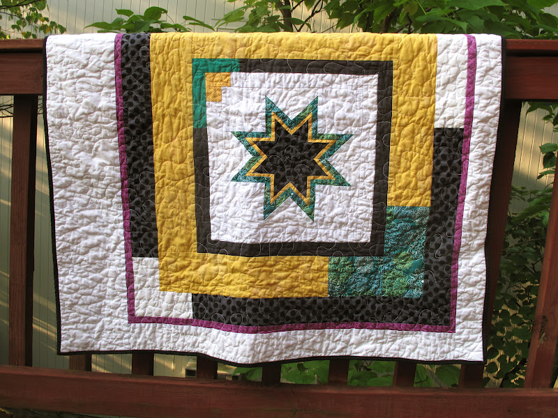
A couple months ago, Pat Bravo asked if anyone would be willing to make Project Linus quilts out of her Art Gallery scraps. I responded yes, and lo and behold, a ginormous packet of scraps arrived at my house. They ranged across her collections, so while the aesthetic was fairly constant, the colors and sizes were not. I spent a while trying to figure out how to tame the scrappy wildness. Then I remembered Cara's designs for her guild's Habitat challenge and found my answer.

The big zig, which I have taken to calling, The Arty Zig, uses string-pieced blocks and a lot of negative space to make a statement. Or at least a large zig-zag. I made 8" blocks and randomly added the strips.

I'm not sure random was the best method, as it was a tad tricky to place the blocks in a pleasing manner given the range of colors involved. But the blocks were made and I was not remaking them. Now that I've made this once, I can see all sorts of possibilities -- fading from one color to another, multiple zig-zags within the big zig, a strip zig, and the like.

And, in what has become a common refrain in two-hippos-land, I love love love the back. Probably more than the front. There were three big chunks o' scrap in the bag and I used them for a riff on (or merely a column of) Oh Fransson's New Wave quilt.

I never thought I'd say it (so mark it down in the record books), I admit that I find that pink + coral print rather pretty. That's right, on my half birthday in 2012 (31.5 for those keeping track at home), I acknowledge that, on rare occasions, I do in fact like pink fabric. Emphasize the rare, ok? I don't want my anti-pink reputation ruined.

Which leads me back to teal, possibly my most favorite shade of blue ever and always a good option. I made this binding out of 8 million (or 30ish) scraps, some from Pat Bravo's bag o' wonders and some from yardage scraps I had in my own scrap bin. Teal is fabulous, let's just reiterate that in light of comments above.

Read more...

  © Blogger template Autumn Leaves by Ourblogtemplates.com 2008

Back to TOP