Showing posts with label color. Show all posts

Spring Bounty

>> Tuesday, August 12, 2014

I made and distributed quite a few quilts this spring. I even remembered to take pictures of most of them, but I completely failed on the blogging front. I'm going to try to remedy this backlog for the rest of the month....

First up, what I like to think of as Spring Bounty. Lots of color, lots of favorite fabric tidbits. It's a baby quilt that I made using Jenna's Arizona Quilt tutorial.

The center squares for the quarter log-cabins are an array of neutrals, ranging from white to cream to taupe (or is it beige? I'm not really sure sure what the difference between taupe and beige is except I asked my new landlord if the walls were beige as I recalled them to be from pictures and he responded that they are light taupe. Anyways....) The brights are all from the stash and mostly from my scrap bins. It was fun to pluck out fabrics I really like, since I didn't necessarily need much to make the blocks (hence some logs are on the skinner side, just depended what I had, which was perfect for the patter).

Can you see the quilting? Maybe, maybe not. It's an organic, slightly unevenly spaced and occasionally wavy-lined grid. I like easy quilting and eyeballing it without too much concern for precision (ummm, or none at all) was pretty perfect. I think I borrowed this quilting idea from Latifah. Indeed, I did: from her marvelous Big O quilt.

The back is pieced and brings together an assortment of bright, fun prints that coordinate with the front. The middle multi-color print is one of those fabrics that hung around in my stash for so so long waiting to be used, and I'm glad I finally found the right fit for it.

Spring Bounty now lives with Talia in Maryland, though Napoleon may be using it just as much.

Read more...

Into the Blue

>> Friday, August 30, 2013

A few weeks ago, about five days before I left Michigan for a conference in New York, I made plans with my friends Josh and Adam who, as it turned out, just returned to the city with their new son. Josh and I have been friends since high school and it's the sort of friendship sustained over irregular yearly-ish visits rather than regular emails and phone calls. Hence it was only when I announced I was flitting through town that I learned about Leo's arrival. At which point a flurry of fast sewing and quilting ensued.

I decided to continue the minimalist monochromatic series with a perennial color favorite: aqua. (Also, I knew I had enough solids or near-solids to make this design work, which is not something I can say for most colors. Aqua: it speaks to me and makes me buy it.) Working on a fast deadline meant that simplicity reigned, and a giant starbust seemed fun and (relatively) simply. I drafted 4 20" blocks on butcher paper and paper-pieced the quadrants. Keeping giant pieces of fabric in line was a tad tricky, but I only had to unpick and resew 2 seams, which I considered a victory.

Keeping with the simplicity theme, the back consists of two large pieces of fabric from Erin McMorris collections: a large red chunk from Weekends and a smaller saffron bit from LaDeeDa. I had been waiting for an opportunity to use the large red flowers, as chopping this particular large-scale print seemed counterproductive. I made this quilt a couple weeks after Rossie's thoughtful post about gender and quilting, and I was particularly pleased to use a giant floral print on a quilt for a boy because, seriously, flowers are awesome for everyone (in fact, it was a former male roommate who taught me that sometimes you should just buy flowers for yourself, because they're lovely and pleasing to look at and increase joy).

The quilting is "echo-plus," which is to say quilting lines offset about 1/8" from each seam, plus a line through the approximate center of each wedge. Enough to hold the quilt together but scant enough to keep it soft and drapey. When I arrived with the quilt, I learned that my color selection was prescient as Leo's room has a Tiffany blue accent wall.

Black and white chevron-striped binding? Yes, please. I adore this binding. I'm convinced it's brilliant, so don't tell me otherwise. The stark contrast between the soft aquas and the robust black thrills me. Also I got to sew it with black thread and I so rarely use black thread that I think the spool has been with me for at least 5 years. It was crying out to be used.

Read more...

Summer in San Francisco: A Quilt

>> Sunday, May 26, 2013


The grass was wet and I needed to take pictures of the quilt. I toted it around with me as I ran errands, attended a party, and went about my weekend business. As I was returning home, I noticed this abandoned auto garage and decided to take advantage of its industrial chic driveway to take pictures. I assume everyone walking and driving by thought I was nuts (it's on the edge of a neighborhood, along a busy road, so there were plenty of people available to gawk). What you can't see, or can't see well, in this image, is the barbed wire above the "no parking" sign. Alas I forgot the towels and other means of circumventing barbed wire (you learn a lot from watching crime procedurals...Burn Notice is particularly effective for acquiring such knowledge). Ah well. Back to the quilt.


This started as low-volume play with triangles, a riff on the March weather that tacked between gray and gray. I rummaged through my scrap bin and stash and plucked out a variety of solid, almost-solid, and light prints, and cut away. The light gray, green, and blue solids became powerfully saturated (context: it matters, as we historians like to repeat, over and over and over again), but watching the whites and creams duke it out as the rows came together was equally fun.


One of the best aspects of random layouts is the fact that mistakenly sewing a row in the wrong order doesn't matter. I might have done that. Possibly twice.


The green and blue tree print (Marimekko) needed to go on the back, or rather needed to be displayed in large quantities and thus needed a spot of honor on the back. That represented one of the first decisions I made in planning this quilt. I had no idea what would join it until I needed a back and started mixing and matching options. I'm pretty sure the remnant triangles are my favorite part of the back. Until my eyes linger on the coral-orange stripe and I like it best. It's so hard to choose among awesome design elements, but handily I don't actually have to actually make a decision. I like the back a lot, that's all.


The diamond quilting--offset by what is a little more than 1/4" inch but less than 3/8" of an inch (5/16", it would seem)--pleases me greatly. Especially on the back where it stands out and looks very quilty. The binding comes from an ombre Marimekko remnant that shuffles between grey-blue and deep green. At one point I know I had a fabulous name for this quilt, but my brain has siphoned it off to somewhere presently irretrievable; as a result, I shall dub it Summer in San Francisco, for that's where it will lodge, and the colors are, in a way, quite reflective of delightfully chilly SF summers.

Read more...

Crunch Time

>> Sunday, March 24, 2013


When I was in college (in the olden days), the dining halls had a bread table, and on the bread table sat a box of matzah -- presumably left over from Passover and set out until consumed. During my first year, I learned that there were people who actually liked matzah. This was a revelation, as I could not fathom how one could enjoy the taste of cardboard. It turns out that when one does not eat it for 8 days every spring, one can like it. I mean, it still boggles my mind, as I limit my matzah consumption to small amounts on Passover, but still, there's something in there for the psychologists to think about.


A friend recently enlisted my help in a gift project, and to help her, I realized I needed to figure out how to piece certain Hebrew letters, notably the tzadik (above). Rather than make a lonely letter, I decided to make a word -- matzah -- and then make it into a matzah cover. This was timely, since Passover starts tomorrow night. I kept things simple and made white letters and used a blue/green ombre fabric (Marimekko scraps). I wanted the quilting to evoke matzah (which is sort of grid-like in appearance) without sewing over the letters. I tried out some straight-edge free-motion quilting which, I learned, is harder than curvy free-motion work. Or maybe I just need more practice. I like the effect, imperfectly sharp lines and all.


I dug into my scrap bin for the back and played around with some improv curves. I think I might make a bigger quilt with curvy columns. Usually I choose my binding to make a quilt pop, but this time I decided to emphasize the ombre fabric and use it to bind the quilt. It blends along some edges and pops along others. I like it.

Read more...

Into the Emerald Woods

>> Tuesday, February 12, 2013


Way back when, in the fall, when there were still yellow leaves dancing in the trees and fluttering on the ground, I had this idea for a quilt series: monochromatic, two-tone, shape-focused quilts. I made one, pulled the fabric for a second, and got stymied for time. But perhaps it will be a series developed over many months, a yearly touchstone of Two Hippos designs. Or it will stay in my head. Which is fine too.

The front yard is currently brown with specks of old snow, maybe even a few remnant piles of white glory. But every fall it gets coated in brilliant yellow, providing the perfect backdrop for a very green quilt (pre-washing -- had to take advantage of the color). For the record, I made this before Pantone selected Emerald as the color of the year, but obviously they read my mind. The particular greens came from my unlabeled stash which means I cannot tell you where to find them. I sort of think one of them was from P&B textiles, but that's all I got. The binding was Moda Orange, I know that.

It started with the medium chevrons, pieced from 5" squares turned into HSTS sewn together into chevrons. At one point, it was all chevrons plus negative space. I liked it but didn't love it. Also, it was a touch small and I was out of the darker green fabric (a regular issue when one quilts from stash and does not plan ahead of time -- it's more fun this way, I promise).

In a quest for movement, I added the line (cue first week of 9th grade geometry and lessons on points and lines. I mostly remember the teacher talking about dots as points and points as lines, beyond that I much preferred algebra to geometry). I considered upping the green quotient with some bright lime, but I held tight to my two-toned vision.

Until the binding, when I auditioned several more greens and, on a lark, some orange. It needed orange. But before I bound, I quilted, in irregularly spaced curvy lines. It's one of my favorite quilting methods (imprecise, fast, crinkle-inducing, and echoed the Mendocino backing fabric -- super soft stuff, that Mendocino line). It was tempting to keep this one, but it was too small for me to use (at about 36"x45") and too large to hang. Instead, it made its way to Chicago and the hands of the young Judah Oliver, whose parents, I happen to know, also adore green.

Read more...

A Little Spice

>> Thursday, December 27, 2012


Sometimes the closet provides the perfect upcycled wrapping. Because a warm, flannel-backed quilt might just save you 10 percent on your heating bills this winter. I finished this quilt right before I went home for Thanksgiving, and I wanted to make sure it stayed protected in transit. That, and I needed to deliver it to the person who commissioned it as a wedding gift, and I thought she'd enjoy the temporary wrapping.


I showed a few glimpses of the quilt in progress way back when I started it. As noted then, the design is based on Felicity's lovely Sea Glass on Sand, and based on her (and other feedback) I added in a couple of mulberry triangles to pop against the browns, greens, and creams. The colors, along with the seasonal scents they evoke and the occasion for the quilt, led me to dub it "A Little Spice" as I constructed it; the name stuck. The color scheme is a little different from my typical choices, but it was designed for the couple whose apartment is decorated in creams with green and brown accents. Working out of my color comfort zone pushed me to think about design, and how a quilt could sing in a more muted palette.


I love how the bright white draws the eye in as much as the greens and darker tans. The blocks were all 6" and I originally planned a 10x12 layout, I added an extra row to make it 10x13 (or 55"x71.5") as I pieced it together. The seam allowance ate up the 1/2" between rows and while I knew that would happen, I felt a need to compensate. Or at least make sure there would be room for the couple's toes. I borrowed the quilting plan from Felicity as well, using 2 interlocking curves on the diagonal -- a technique I'll certainly use again.


The quilt commission came with a request for a "soft back," and I opted for flannel. A flannel sheet from Target to be specific. The sheet is thicker than quilting flannel, so that plus a layer of batting makes for a substantial throw quilt. Using a sheet also eliminated the need to piece the back and, as it was bigger than the front, simplified basting as well. The binding is a Heather Ross print, Meadow Flowers, I picked up in the sale vault at Lake Street Mercantile about 4 years ago. Apparently I could have sold that yard for about $36 right now (admittedly, it's no goldfish), but I'm content to let aesthetic value trump financial gain. Plus, if someone had purchased it, I would have had to go to the post office between Thanksgiving and Christmas, and that surely represents a terrible use of time.

Read more...

Scattered Color Pop (Mini Tutorial Included)

>> Tuesday, November 13, 2012


There's nothing like a quilt show & sale to make quilt tops jump off the shelf and get themselves backed, quilted, and bound. I might have played a little role in this process, but the importance of deadlines in my life cannot be overstated. I made this quilt top last winter, after which I dallied finishing it. Most of my sewing projects arise with a recipient in mind, whereas this one started with an idea and no recipient, which is where the no deadline issue arose. But finished it is. And love it I do.


A few people asked me about size, fabric requirements, and the like so I'm going to provide a mini-pattern-tutorial. As half-square triangles represent the entirety of the block-making, and the layout is random, I'm really only providing some numbers and measurements. This particular version finishes at about 54" x 58.5" (12 rows, 13 columns), but it's super easy to upsize or downsize: make more (or fewer) blocks. In other words, figure out the dimensions (rows/columns), multiply, and the product = necessary HST blocks.

Supplies
1 charm pack (42 5" squares)
25" of 3 coordinating solids, cross-cut in 5" WOF strips

Cut 5" strips into 38 5" squares (if you cut all the strips, you'll have 40 squares of each solid. You could use 40 each of 2 solids and 34 of another, thus only requiring 4.5 5" strips on one color (if, say, you have solid scraps and not quite 25" of one). I think I used 42 5" squares of the off-white and khaki, and 30 of the gold, but I can't recall and I'm too lazy to count HSTs in the quilt itself. The point is: this is a versatile, flexible design. Use what you have!

Divvy up each group of squares into thirds. You should have 12 piles. As 38 does not divide evenly into 3, the groups won't be the same size. Then pair up the piles as follows (substituting whatever colors you're using): (1) charms/off-white, (2) charms/khaki, (3) charms/gold, (4) off-white/khaki, (5) off-white/gold, and (6) gold/khaki. Make sure each pile consists of full pairs. The piles with the charms should have 14 charm/solid pairs, while the solid-solid piles will vary depending on how you divided 38.

Sew squares into half-square triangles, using your preferred method. I draw a diagonal line down the center, stitch a scant 1/4" on both sides, cut on the line, and voila, 2 HSTs ready to be pressed. Trim your blocks. With 5" starting squares, I usually trim down to 4 5/8" but you might be able to eek out 4.75" or prefer to play it safe with 4.5".

Lay it out -- I start by grabbing squares randomly and then rearranging to get a reasonable distribution of color. In the end, it is not random in the mathematical sense, but visually it feels random. Sew it up. Take a break, have a drink, eat a treat, and admire your lovely quilt top.


Since this quilt is now finished, it has a back too. I pretty much adore this quilt back. It's got bright colors, birds in cages, ugly ducklings, and a slight little angle that I'll pretend was completely intentional. Totally planned. Because that's how I do it. I pulled stash prints that coordinated with the charm pack (It's a Hoot), at which point I realized it needed a red binding.


So I made one. Bright red Riley Blake circles. Works with the front and the back.

Perhaps you'd like to see this quilt in person and possibly even buy it for yourself or a loved one? If you're in SE Michigan or NW Ohio or South-Central (???) Canada (what's the Windsor, ON region called?), it will be at the Ann Arbor Modern Quilt Guild Show & Sale this Thursday (November 15) at the Corner Brewery in Ypsi, 5-9 pm. You should come. If I don't know you, I'd love to meet you. And if it doesn't sell at the show, it might make its way to a little pop-up quilt, challah cover, and clutch sale here on the blog, in the near-ish future.

Read more...

The Accidental Living Room Quilt

>> Thursday, October 18, 2012

Making things for myself is paralyzing. How do I decide on a design or choose fabric when I'm not going to design something I dislike or buy fabric that is unappealing? And how do I pick the perfect palette for the living room I already live in? Admittedly, the (super comfortable) gold couch is perhaps not the item I would select from a store, but free, old-in-the-best-sort-of-way, and did I mention amazingly comfortable rocks (thanks grandparents for making some great furniture purchases back in the day).

Two springs ago I was temporarily living in DC. I toted a small portion of my stash with me (sanity protection) and resolved to make stuff within the parameters of what I brought. That small stash included 2 charm packs of Kate Spain's Central Park line, and a lot of solids. I challenged myself to make a big quilt with those charm packs, and by adding a lot of solids, I succeeded.

I followed no particular format in laying out the fabric. I probably tried to avoid setting the same fabrics next to one another, making it not totally random, and I may have adjusted squares as I sewed them together. To be honest, I don't really remember how I did it all that clearly. I do recall wishing I had used green instead of yellow as the most significant solid at one point, but having already cut out  lots of yellow squares, well, no change was in the works. Unlike most of the quilts I make, this one had no intended recipient. As a result, when I finished the quilt top I had no need or incentive to finish it quickly, and it sat on a shelf for months.

Last winter I decided I needed to move this project from the unfinished pile to the finished one. I dug into my stash to find fabric to back it, and decided to use the Alexander Henry Birdsong as the primary backing. Then I added coordinating fabric to make it big enough to fit the front, quilted it 1/4" lines offset from the seams, and bound it. I washed it and wondered to whom I should give it. It sat on a chair in my living room, waiting to move on to its new home.

Summer faded into fall, and one night I wanted to burrow under a quilt while reading on the couch. Rather than dig up a blanket from the closet, I grabbed the one sitting on the chair. I wouldn't have expected the pale yellow to work with the gold couch but, in a way, it does. It's not exactly the design or colors I would have picked for my living room, but it works. The binding isn't my favorite shade of green, but it doesn't really matter. It's a lot easier to let a quilt find a home in my living room than design one specifically for it. So much less pressure, so much more pleasurable.

Read more...

Sewing: It Still Happens

>> Friday, October 5, 2012

The Jewish holiday season, some travel, a chapter deadline, and a few other obligations conspired to make me take an unintentional sewing hiatus. It's kind of hard to sew while on a plane, in synagogue, or while furiously typing. (Though if I could multi-task simultaneous dissertation writing and sewing, I would be a superhero. Just sayin'). In any event, I granted myself some sewing time this week as a reward for submitting said dissertation chapter (incentives: they work). I've had a quilt block in my head for a few weeks now, and decided to test it out. Often this means drawing on some graph paper before cutting and piecing, but this time I decided to go for the direct brain to fabric option.

Mental math is pretty awesome, but sometimes comes with a bit of imprecision. I won't say exactly how many times I had to rip out seams on each of these blocks (probably more than once but less than a handful -- let's keep it in general terms), but there was some mental cursing and aggravated looks directed at the blocks. Millimeters are finicky things, in case that was unclear. Last night the Southeast Michigan Crafty Meet-up allowed me finish some blocks and start sewing them together. At which point a number of people noticed that my quilt color scheme coordinated with my wardrobe (Atomic Washi, woot!), and documentation of this occasion became necessary. One friend has asked why there is a traffic light in the background, and since I don't know, I welcome all suggestions and stories as to how and why a traffic light would find its way into the scene.

Read more...

Meanwhile, at Chez Two Hippos...

>> Thursday, July 26, 2012

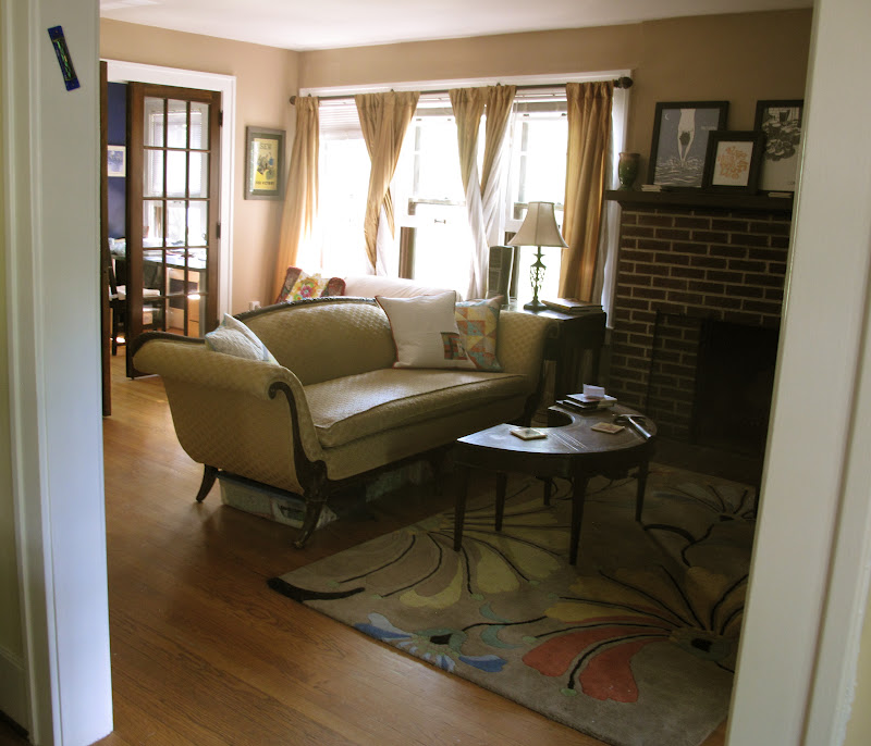
There has been a little redecorating afoot at Chez Two Hippos. Namely, the hanging of pictures and the making of new pillow covers in the living room (which also functions as my sewing space -- see back left corner). This has been a long time coming, or at least 9 months coming. There used to be cranberry trim (including all the windows) in this room. Cranberry trim is a terrible idea. Perhaps you want some deep red in your room? I highly recommend a wall.

After three years of muttering obscenities about said cranberry trim, it was time to do something about the horribleness. So, much like a Soviet dissident in the days of yore, it got disappeared last fall (I've been reading crime fiction set in mid-20th century Eastern Europe...). White trim is quite lovely. At the same time, the walls received some paint love (Olympic Park Loop, if I recall correctly) and I took the plunge and acquired (rather inexpensively, thanks to a super sale and $1 shipping) a fun area rug. A few months later, I bought a map. It looked good in the room, even if it sat on the floor waiting to be hung for another 5 or so months. The cranberry pillows, however, remained.

Until I returned from research this summer and couldn't stand them any more. At which point, I had to change them. Immediately.  And there commenced about 16 hours of furious design and sewing, after which three new pillow covers made everything better. As I don't do matchy-matchy very well (or at all), I opted for different designs in three shades of the same palette -- bright (above), muted (below), and dark (below) -- all of which coordinate with my gold couch. Sidenote: the couch belonged to my grandparents' and it is the world's most comfortable couch. Back to making things...the design above was inspired by Rebecca's pillow. I think if I were making it again, I'd use a solid white instead of the Echo print, since it's a little busy for my taste, but it works. And since I used scraps of some of my favorite prints, I get to see some of my favorite prints all the time. Win.

Originally I planned to make the HST pillow (on right) with solids, but when I laid out the solids, they weren't speaking to me. Or they were, and they were saying "don't use me." Which was great because I got to dig into some stashed favorites, including the orange Heirloom Tile and the yellow and gray prints from Dena Designs' Taza collection.  The improv pillow (left) is definitely my favorite: solids + negative space + circle quilting = awesome. I admire those who circle-quilt much larger pieces because, damn it takes a lot of time and focus.

There's something about this picture line-up of pillow backs that makes me chuckle. They're all envelope closures, though a touch different at the overlap point (broad band of contrasting fabric, no contrast, and thin band of binding). Here too, I dipped into some stash favorites (for the fabric followers -- Nicey Jane + Park Slope (L), Central Park (M), and Max & Whiskers (R)). So there you have it: a much-aesthetically-improved living room.

Read more...

Gentle Curves

>> Tuesday, February 21, 2012

Even I can be a delinquent student. The one who shrugs off an optional assignment as unnecessary. The one who figures "I've already done that" so why redo it. The one who prioritizes other things. In this case, the class is Rachel's Curves class and I confess that I waited until the "Rainbow Road" project to do anything more than watch the videos and read the project instructions. Because I don't need any bibs (though they would make a nice gift) and I had already made a scallop quilt, I passed on the first week of projects. Also, I was in Kansas sans sewing machine, which made it somewhat impossible to sew anything.

But I knew I would try my hand at improv curves and this project in particular. Never one to exactly follow instructions, I turned to my scrap bin instead of a rainbow of solids, and came up with this orange and aqua meandering path. I also started piecing the orange and aqua scraps together before the instructions were posted so I constructed each row a little differently, but to no ill effect. I think it's going to become a challah cover once I bind it (perhaps in a reddish-purple?). I also think it will be gifted to a friend, but that's a surprise for now.

This week's classes focus on precise curves -- which I really want to figure out. But I'm reclaiming the sewing slacker label for the next week as I'm off to Utah for research, sans sewing machine yet again. However, I am under the impression that there are amazing quilt shops on every corner of every street in Utah, so please point me to them! I'll be in Salt Lake City for the most part, with a possible day trip to Provo for some material held at BYU's library and special collections. Of course, restaurant, sight-seeing, and other recommendations are always welcome...

Read more...

The Arty Zig

>> Friday, January 27, 2012

A couple months ago, Pat Bravo asked if anyone would be willing to make Project Linus quilts out of her Art Gallery scraps. I responded yes, and lo and behold, a ginormous packet of scraps arrived at my house. They ranged across her collections, so while the aesthetic was fairly constant, the colors and sizes were not. I spent a while trying to figure out how to tame the scrappy wildness. Then I remembered Cara's designs for her guild's Habitat challenge and found my answer.

The big zig, which I have taken to calling, The Arty Zig, uses string-pieced blocks and a lot of negative space to make a statement. Or at least a large zig-zag. I made 8" blocks and randomly added the strips.

I'm not sure random was the best method, as it was a tad tricky to place the blocks in a pleasing manner given the range of colors involved. But the blocks were made and I was not remaking them. Now that I've made this once, I can see all sorts of possibilities -- fading from one color to another, multiple zig-zags within the big zig, a strip zig, and the like.

And, in what has become a common refrain in two-hippos-land, I love love love the back. Probably more than the front. There were three big chunks o' scrap in the bag and I used them for a riff on (or merely a column of) Oh Fransson's New Wave quilt.

I never thought I'd say it (so mark it down in the record books), I admit that I find that pink + coral print rather pretty. That's right, on my half birthday in 2012 (31.5 for those keeping track at home), I acknowledge that, on rare occasions, I do in fact like pink fabric. Emphasize the rare, ok? I don't want my anti-pink reputation ruined.

Which leads me back to teal, possibly my most favorite shade of blue ever and always a good option. I made this binding out of 8 million (or 30ish) scraps, some from Pat Bravo's bag o' wonders and some from yardage scraps I had in my own scrap bin. Teal is fabulous, let's just reiterate that in light of comments above.

Read more...

  © Blogger template Autumn Leaves by Ourblogtemplates.com 2008

Back to TOP