Orbs Away

>> Wednesday, August 22, 2012


I had plans to make a completely different quilt. But Austin was born a couple weeks early and I had a chance to hear about him before I actually made the quilt (the benefit of being behind on gift-making?). Suzi told me that Austin was intense, and vacillated between "Baby Snuggles and Baby Landlord." I wanted to make something that reflected intensity but with a little funk. Then I saw Leanne's pattern-testing post, and followed it to Julie's Mod Pop pattern introduction.


It was time to hack, modify, reverse-engineer. I wanted to make the orbs Julie used but allow them to stand out a bit more (which is also to say I wanted to take advantage of negative space and make a less busy pattern or, ahem, be a little lazy and make fewer orbs and less patchwork). My orbs are imperfect as I trimmed my drunkard's path blocks with a 3/8" edge instead of 1/4" because the piecing foot I was using created a generous 1/4" seam allowance. This was a mistake, but one I didn't realize until it was too late -- or would have required too much seam-ripping for my taste. Crafty imprecision and imperfection are rather fetching, I think, though I realize not everyone feels the same. Which is all to say that I'm not sure what Julie's instructions call for, but you can get her pattern here if you want to make her version or don't want to fiddle with sketches, graph paper, or numbers to make your own.


Besides, if you squint hard enough, the edges look perfect. Just squint harder and you'll see what I mean.    Lovely as it is, Moda Dill does not match any of the thread choices at my local Joanns. In the past, I've simply used a lighter green, but since I was at the store and needed to buy thread, I decided to make a radical move into variegated thread. That stuff is cool.


I used Moda Dill as the background color for three reasons: 1) I had a bunch of it, 2) Suzi likes green and she'll be seeing the quilt in its full color glory before Austin will recognize green as a distinct color, and 3) I really wanted to use the Alexander Henry Zoo print on the back. I've had the big and mini zoo prints in my stash for several years and they had proclaimed a need to be used (on their chatty days, obvs).


Every time my eyes focused on the elephant in the zoo print, I worried that my stippling had gone awry and there were random threads dancing across the quilt back. I don't know why the white line on the elephant was so different than the lines across the giraffe or ostrich or rhino, but it was different. Alas, it turns out my eyes were playing tricks on me. For the binding, a print from the blue/green colorway of Denyse Schmidt's Picnics and Fairgrounds line helped bring together front and back.

Read more...

A Few Snippets

>> Wednesday, August 15, 2012

Literal Snippets.

And more figurative ones. I spent the weekend with many of the lovely ladies of the Ann Arbor Modern Quilt Guild. Lots of sewing, lots of delicious food, and lots of laughter. I finished a few quilts, including my lingering do.Good Stitches quilt from March, and I started some new ones, including one that uses the star block above. Well, actually, the star block above is a little hack from pattern testing since, to be honest, I'm not the best at fully following quilt directions. I just can't resist a little tweak here and there. Luckily, Debbie was patient with my insatiable need to modify, adapt, alter, and improvise.

In addition to some starts and finishes, I also joined the Instagram bandwagon (you can find me there as two_hippos). At the end of June, my brother convinced me (or rather, the math of family plans convinced me) it was time to upgrade to a phone that could do more than allow me to talk to people (that is the purpose of phones, right?). I'm slowly learning the different things aside from connect my voice to other people's voices that said phone can, in fact, do. I'm a little resistant because I'm trying to avoid feeling tethered to it, but I admit I do like instagram and its fancy filters and whatnot.

Final snippet: Washi dress. In-progress. Major thanks to Rae and Karen for patiently guiding the quilting sort into garment-making.

Read more...

Tutorial: How to Make a Challah Cover

>> Tuesday, August 7, 2012

One of the most frequent queries I get is "how do you make a challah cover?" I've avoided answering this question directly because there is no one way to do it. In a pinch, an unfolded napkin is just as functional in covering challah (delicious egg bread eaten on Shabbat (the Jewish Sabbath) and most Jewish holidays) as a beautiful silk-screened, embroidered, quilted, or otherwise crafted piece of art.

But Sew Mama Sew has provided me with a wonderful opportunity to demonstrate how to make a challah cover. The tutorial includes templates for paper-piecing Shabbat in Hebrew as well as complete cutting and piecing instructions. Even if you don't need one for yourself, here's a chance to impress your friends when you give them a fabulously modern challah cover with Hebrew letters. (A big thanks to Michelle, Anna, Brenda, and Torie for making sure the templates and instructions made sense to non-Hebrew speakers.) It may be in another language that uses a non-Roman alphabet, but you don't have to be able to read it to piece it!

Head over to SMS for my Challah Cover Tutorial. I'd love to see what you make!

p.s. If you want to machine-bind your challah cover, you can find my machine-binding tutorial here.

Read more...

Foxy

>> Sunday, August 5, 2012

When Lizzy House's Outfoxed line came out last fall, I thought it looked fun, but I was trying to reduce fabric purchases until I got the stash under control. A few months later, when I found out my first quilty-blogland friend Michelle was pregnant with Kit, I had a good reason to buy a yard of Outfoxed. More specifically, I grabbed a yard of those clever foxes in the Outwitted (yellow/green) colorway, so I could make a gender-neutral quilt for the as-yet-to-be-gendered-or-named baby-fox-to-be.

That was the plan anyways. Despite my winter acquisition of a piece of fabric, Kit debuted with no quilt on hand, or even in my head. I had some vague ideas based on Michelle's flickr favorites (because, let's be honest, she's going to appreciate the quilt more than her child, at least for a while), but nothing really stuck. To an extent reasonable (it's true, sometimes I make up new phrases), I wanted to combine our styles. Which can be a little tricky, like a fox.

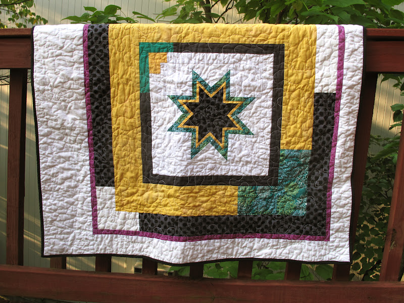
Michelle is a paper-piecing rock star, so that seemed like a good place to begin. And I'd seen these 8-pointed stars around blogland for a while; I'd even printed out the templates. Actually, I printed them twice, as my July self did not recall that my April self had already printed them. Now I can make another, I suppose. I love the outcome, but that star took several hours of an evening to master, so I applaud anyone who makes lots of them. After that evening, I knew this quilt would feature one star and one star only.

Which is where my love of asymmetry, pops of color, and negative space comes in. Because one star can make a very fine modern quilt. The purple was a last-minute addition, when the yellow/green/black/white combo seemed to lack a little pizzazz. And goodness knows, infants need pizzazz in their vision fields.

I happened to be perusing the shelves at Brenda's shop while contemplating the back. I only had a yard of Outfoxed, and the quilt grew to be a bit larger. I saw Aneela Hoey's Foxlets print and it obviously needed to join the other foxes on parade, or around the campfire.

The binding followed the design of the quilt front: mostly black, with a teal corner. Deciding what thread to use to machine-bind it posed a bit of a quandary, but in the end I opted for black. It stands out on the teal portion but disappears into black fabric. Aside from the fox fabrics, everything else came from my stash, so even Foxy, as I began to refer to it while sewing it together, contributed to stash reduction.

Read more...

Quilting Play

>> Wednesday, August 1, 2012

Ever fascinated by circle quilting, I spent Sunday playing with some new quilting ideas. Like these concentric adjacent, but not overlapping, circles. From the back, I think they look especially cool. They look rather dashing on the front as well, but it's got to stay face-down for a moment.

I used the same 4" circle template for a some random overlapping circles. Planning out the overlap would have required a little too much work and attention since I was quilting while watching the Olympics streaming on my laptop. It was a tough call between women's gymnastics team preliminaries and quilting. Luckily I delight in multi-tasking, but priorities do shift a bit when people on the screen are flying through the air. I'm willing to sacrifice my personal precision for theirs, especially because "randomly imprecise" has a certain panache in quilting that it does not on the balance beam.

Read more...

Meanwhile, at Chez Two Hippos...

>> Thursday, July 26, 2012

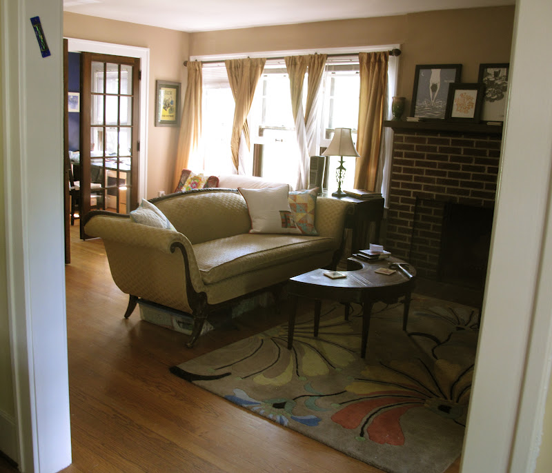
There has been a little redecorating afoot at Chez Two Hippos. Namely, the hanging of pictures and the making of new pillow covers in the living room (which also functions as my sewing space -- see back left corner). This has been a long time coming, or at least 9 months coming. There used to be cranberry trim (including all the windows) in this room. Cranberry trim is a terrible idea. Perhaps you want some deep red in your room? I highly recommend a wall.

After three years of muttering obscenities about said cranberry trim, it was time to do something about the horribleness. So, much like a Soviet dissident in the days of yore, it got disappeared last fall (I've been reading crime fiction set in mid-20th century Eastern Europe...). White trim is quite lovely. At the same time, the walls received some paint love (Olympic Park Loop, if I recall correctly) and I took the plunge and acquired (rather inexpensively, thanks to a super sale and $1 shipping) a fun area rug. A few months later, I bought a map. It looked good in the room, even if it sat on the floor waiting to be hung for another 5 or so months. The cranberry pillows, however, remained.

Until I returned from research this summer and couldn't stand them any more. At which point, I had to change them. Immediately.  And there commenced about 16 hours of furious design and sewing, after which three new pillow covers made everything better. As I don't do matchy-matchy very well (or at all), I opted for different designs in three shades of the same palette -- bright (above), muted (below), and dark (below) -- all of which coordinate with my gold couch. Sidenote: the couch belonged to my grandparents' and it is the world's most comfortable couch. Back to making things...the design above was inspired by Rebecca's pillow. I think if I were making it again, I'd use a solid white instead of the Echo print, since it's a little busy for my taste, but it works. And since I used scraps of some of my favorite prints, I get to see some of my favorite prints all the time. Win.

Originally I planned to make the HST pillow (on right) with solids, but when I laid out the solids, they weren't speaking to me. Or they were, and they were saying "don't use me." Which was great because I got to dig into some stashed favorites, including the orange Heirloom Tile and the yellow and gray prints from Dena Designs' Taza collection.  The improv pillow (left) is definitely my favorite: solids + negative space + circle quilting = awesome. I admire those who circle-quilt much larger pieces because, damn it takes a lot of time and focus.

There's something about this picture line-up of pillow backs that makes me chuckle. They're all envelope closures, though a touch different at the overlap point (broad band of contrasting fabric, no contrast, and thin band of binding). Here too, I dipped into some stash favorites (for the fabric followers -- Nicey Jane + Park Slope (L), Central Park (M), and Max & Whiskers (R)). So there you have it: a much-aesthetically-improved living room.

Read more...

Carry On

>> Friday, July 13, 2012

I will never be mistaken for a designer handbag aficionado. I couldn't identify one to save my life. And it seems that most of them are made of leather, so it's not going to happen. But since I still tote things around with me, I do need something in which to place it. Ideally that something will 1) hold my wallet (a sorry little rubber-banded item at the moment), phone, a book, and maybe a light sweater, 2) be versatile, and 3) make me happy. In case you're wondering, the latter results from a secret combination of size, functionality, and fabric.

For errand-running and multiple-book-toting, I find my Lickety Split bag super useful. But it's less than ideal for going out or simply carrying fewer items. Sarah has a great free tutorial for this purse, which I found through some combination of googling "purse, trapezoid, and pleats." I knew the shape I wanted, but didn't really want to work out all the details. The internet, and crafters who also work as engineers, are quite handy in this scenario. I've been waiting to use this print (Amy Butler's Water Bouquet in Midnight, from her Love collection) and found another use for the remnant of grey hexagon dots from this quilt. I modified the pockets to fit my wallet and phone, and added a slot for a pen (an effort to avoid ink splots all over the interior). If I made it again, I'd add more interfacing around the magnetic snap, but save that detail, this purse is perfectly sized and straightforward to make.

Read more...

Squeaking By

>> Wednesday, July 11, 2012

Deadlines and I have a contested relationship right now. Witness: My June do.Good Stitches blocks.

Heather asked us to make Lynne's "Lynne Bob Square Pants" blocks with Kona Ash as the background color. I could blame my tardiness on the fact that I was waiting to get back to Michigan and get my hands on some Ash (true) or on being away from my sewing machine for almost all of June (true) or a tree getting in the way of weekend sewing at the end of June (true). All of these factors contributed to my delinquency, but I also confess that once back in Michigan, with my sewing machine, in possession of Kona Ash, I also tarried a bit. These blocks are a lovely, but a bit persnickety for my sewing tendencies. They're going to make a great quilt, but 36 squares yielding a mere 12.5" block? It's just not my style. As I said at the Ann Arbor Modern Quilt Guild's Sew-In on Sunday, 3.5 hours of sewing should require using more than one bobbin.

In the spirit of confession-time, I will also note that this month I definitely have a favorite block. The aqua and red one. I'm pretty sure quilters, unlike parents, are allowed to express preferences among blocks, but I usually try to love them all equally. Not this month, I'm afraid. But that's okay because the quilt chorus is also a lovely place to be.

Read more...

Sand and Sea

>> Friday, July 6, 2012

Some fabrics are more challenging to design with than others. I picked up the block-y, stripey fabric at the Crate & Barrel outlet over a year ago. Of all the fabrics that comprised my 7-pound haul, this was the one that stumped me the most. I couldn't figure out what fabrics would work with it (sure, white would be fine, but it seemed a little boring) and I wasn't sure how it would work in a block,simple or complex. Did the lines need to be straight? If so, there was a problem, because I quickly realized it was impossible to true-up the fabric on the grain and keep the printed lines straight.

About 6 weeks ago, I was using a (generously gifted) groupon at G-Street Fabrics, which was a little tough because their cotton print selection is not, shall we say, all that modern and their solids shelves lacked the obvious suspects such as Kona white, ash, or coal (weird, right?). When my eyes fell upon Bella Solid Wheat, I knew I had a solution to the Marimekko stripe challenge. It may not be the most "modern" of combinations, but it works.

Google Reader helped solve the block conundrum, as I read about Lu Summers teaching a workshop on portholes at the recent Fat Quarterly retreat. While my nomadic life took me many places this spring, it did not plop me down in London for this retreat (surprisingly, the Queen didn't invite me to her Jubilee which occurred the same weekend). But the interwebz are very powerful and led me to Jodie's tutorial, which served my needs perfectly.

I made 10 basic portholes, altering the direction of the stripey fabric in a few different ways. Once I started making the portholes, the rest of the table runner design arrived in my brain. With my predilection for negative space, it should not be shocking that the runner would have a row of sea glass portholes surrounded by sand (or, technically wheat, in which case perhaps there is a clear river running through a wheat field?). The landscape metaphors need not be stretched beyond their means; suffice it to say that a good chunk of the 2 yards of wheat fabric disappeared into this project.

At one point I thought I might make 4 coordinating napkins, except that the remnant pieces were too small. But pieced together, they became the back.

At first I thought I'd just do a little wavy line quilting in one section of the solid area. Then I started, and two bobbins later, I had done a lot of wavy-line quilting in all the solid sections. As you may be able to see, I snuck in a few green lines amidst the natural thread. Usually binding acts as a frame, but this design called for less of a frame  and more of a finished edge. As a result, I used more of the wheat solid to bind it. Despite the oppressive heat, I finished it yesterday, just in time to take with me to Josh and Shannon's wedding party. They had a small April wedding, followed by a fun July celebration. Josh said us grad student sorts didn't have to bring gifts, but I don't always follow directions very well.

Read more...

12 Hours

>> Tuesday, July 3, 2012

Friday started like this -- at my parents' house, reunited with my sewing machine, playing with some new porthole blocks (made using Jodie's tutorial). I made such blocks and sewed them together into a table runner top, with plans to make the backing in the afternoon and quilt the table runner later in the weekend, before returning to Michigan.

But 12 hours later, Friday ended like this. Well, not like this exactly, because it was dark out by 10.30 pm when the power went out and we heard a large thud. The derecho storm that pummeled the DC area caused a tree to fall on my parents' house. No one in the house -- 2-legged or 4-legged -- was harmed, which is the most important thing.

Friday night was very long, with lots of moving furniture, clipping and clearing (a small number of) tree branches, waiting on hold for hours with the insurance company, and calming terrified animals. The fire department arrived pretty quickly (especially given the number of fallen trees and unpassable roads in the neighborhood) and determined that the house was still safe, provided we stay away from the side that was hit. Neighbors were extraordinarily helpful -- calling the fire department, providing tarps, bringing over helmets and head lamps (neighbors who go for spelunking? very useful in such circumstances), helping to clear out the affected rooms and salvage what we could, trimming and clearing about 100 pounds of tree branches, getting cars out of the way, etc. The local police conducted neighborhood sweeps around 4 am (I wasn't sleeping anyways...) to make sure everyone was ok.

My brother showed up at 6 am on Saturday morning, at which point we could see the full damage. I christened what had been my brother's old room "the sunroom." My mom quickly edited it to "the undesired sunroom." To be fair, it was a terrarium for a bit, but by mid-day Saturday Tyson's Tree had removed the tree (they have a very impressive operation, for anyone looking for tree removal in the DC area) and it was a sunroom, albeit one with blue-tarp filtered light. Yesterday the damaged area was boarded up, and now it's a matter of getting contractors in to assess, estimate, and finally rebuild.

Needless to say, no more sewing occurred over the weekend. I'm now back in Michigan, where sewing may resume if the heat relents anytime soon...

Read more...

  © Blogger template Autumn Leaves by Ourblogtemplates.com 2008

Back to TOP