Orbs Away
>> Wednesday, August 22, 2012
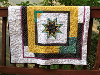
I had plans to make a completely different quilt. But Austin was born a couple weeks early and I had a chance to hear about him before I actually made the quilt (the benefit of being behind on gift-making?). Suzi told me that Austin was intense, and vacillated between "Baby Snuggles and Baby Landlord." I wanted to make something that reflected intensity but with a little funk. Then I saw Leanne's pattern-testing post, and followed it to Julie's Mod Pop pattern introduction.
It was time to hack, modify, reverse-engineer. I wanted to make the orbs Julie used but allow them to stand out a bit more (which is also to say I wanted to take advantage of negative space and make a less busy pattern or, ahem, be a little lazy and make fewer orbs and less patchwork). My orbs are imperfect as I trimmed my drunkard's path blocks with a 3/8" edge instead of 1/4" because the piecing foot I was using created a generous 1/4" seam allowance. This was a mistake, but one I didn't realize until it was too late -- or would have required too much seam-ripping for my taste. Crafty imprecision and imperfection are rather fetching, I think, though I realize not everyone feels the same. Which is all to say that I'm not sure what Julie's instructions call for, but you can get her pattern here if you want to make her version or don't want to fiddle with sketches, graph paper, or numbers to make your own.
Besides, if you squint hard enough, the edges look perfect. Just squint harder and you'll see what I mean. Lovely as it is, Moda Dill does not match any of the thread choices at my local Joanns. In the past, I've simply used a lighter green, but since I was at the store and needed to buy thread, I decided to make a radical move into variegated thread. That stuff is cool.
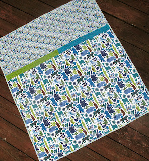
I used Moda Dill as the background color for three reasons: 1) I had a bunch of it, 2) Suzi likes green and she'll be seeing the quilt in its full color glory before Austin will recognize green as a distinct color, and 3) I really wanted to use the Alexander Henry Zoo print on the back. I've had the big and mini zoo prints in my stash for several years and they had proclaimed a need to be used (on their chatty days, obvs).
Every time my eyes focused on the elephant in the zoo print, I worried that my stippling had gone awry and there were random threads dancing across the quilt back. I don't know why the white line on the elephant was so different than the lines across the giraffe or ostrich or rhino, but it was different. Alas, it turns out my eyes were playing tricks on me. For the binding, a print from the blue/green colorway of Denyse Schmidt's Picnics and Fairgrounds line helped bring together front and back. Read more...


