Showing posts with label solids. Show all posts

Point the Way

>> Thursday, February 13, 2014


This was a giant paper-piecing experiment designed around those little slivers of Marimekko fabric. I'd been hanging on to the delightfully silver neutral stripe print for a whole now, and never found fabrics I felt worked with it. In challenging myself to use it, I decided to focus on the colors it included: silver, cream, beige, purple. Without a lot of the fabric to use, I wanted a bold, minimalist design. So I made myself some paper templates (good way to use up 12" scrapbook paper that's lingered in my art supply collection for years) and got to work. The quilt consists of 8 pieced blocks and 4 solid blocks).


Paper-piecing produces pretty perfect points. I made some freezer paper templates of each of the 5 shapes -- the center (1) and edge triangles (2) as well as the slivers (2) to help with cut with minimal waste and avoid almost-but-not-quite-covering a piece of the template (which still happened...but only once...and in a very fixable way). When it came time to quilt, I got a little adventurous and used different thread and different quilting patterns for each fabric. The silver squiggle is my favorite.

For the first time in a while, I went for a super simple non-pieced back. I had just the right amount of this fun, squawking bird print (picked up at Ikea, a few years back), and it added some pattern-y goodness to the minimalist front. A sweet grey binding later, and the quilt was done.

Well, almost done. After I washed, dried, and took these pictures, I noticed that one of the purple seams had come partially undone. This was really weird, since it was a full 1/4" seam and I've never had that happen before (partial lie: it happened with imperfect 1/4" seams when I was a newbie quilter). A little steam-a-seam and a few repair stitches later, and the quilt flew off to Connecticut where it resides with young William (and Cynthia and Andy).

Read more...

Into the Blue

>> Friday, August 30, 2013

A few weeks ago, about five days before I left Michigan for a conference in New York, I made plans with my friends Josh and Adam who, as it turned out, just returned to the city with their new son. Josh and I have been friends since high school and it's the sort of friendship sustained over irregular yearly-ish visits rather than regular emails and phone calls. Hence it was only when I announced I was flitting through town that I learned about Leo's arrival. At which point a flurry of fast sewing and quilting ensued.

I decided to continue the minimalist monochromatic series with a perennial color favorite: aqua. (Also, I knew I had enough solids or near-solids to make this design work, which is not something I can say for most colors. Aqua: it speaks to me and makes me buy it.) Working on a fast deadline meant that simplicity reigned, and a giant starbust seemed fun and (relatively) simply. I drafted 4 20" blocks on butcher paper and paper-pieced the quadrants. Keeping giant pieces of fabric in line was a tad tricky, but I only had to unpick and resew 2 seams, which I considered a victory.

Keeping with the simplicity theme, the back consists of two large pieces of fabric from Erin McMorris collections: a large red chunk from Weekends and a smaller saffron bit from LaDeeDa. I had been waiting for an opportunity to use the large red flowers, as chopping this particular large-scale print seemed counterproductive. I made this quilt a couple weeks after Rossie's thoughtful post about gender and quilting, and I was particularly pleased to use a giant floral print on a quilt for a boy because, seriously, flowers are awesome for everyone (in fact, it was a former male roommate who taught me that sometimes you should just buy flowers for yourself, because they're lovely and pleasing to look at and increase joy).

The quilting is "echo-plus," which is to say quilting lines offset about 1/8" from each seam, plus a line through the approximate center of each wedge. Enough to hold the quilt together but scant enough to keep it soft and drapey. When I arrived with the quilt, I learned that my color selection was prescient as Leo's room has a Tiffany blue accent wall.

Black and white chevron-striped binding? Yes, please. I adore this binding. I'm convinced it's brilliant, so don't tell me otherwise. The stark contrast between the soft aquas and the robust black thrills me. Also I got to sew it with black thread and I so rarely use black thread that I think the spool has been with me for at least 5 years. It was crying out to be used.

Read more...

Sunspots

>> Thursday, August 22, 2013


I was not really prepared for the summer onslaught of babies. Lots of my friends had babies; few quilts were on their way or even gestating in my brain. But this quilt's concept, the fabric pull, and the mulling over of design started this winter, after I made this emerald quilt. I thought it would be cool to do a series of minimalist monochromatic quilts, all offset by a binding in a different color. And since I bound the emerald quilt with orange, I figured orange should be next in the sequence.

At one point I envisioned a giant asterisk quilt. But as June turned into July and I decided to make the orange quilt for the forthcoming bebe of my friends' Sarah and Danny (#2, actually), I was feeling less asterisk-y and more linear. I wanted to play the oranges off one another, and the slats of some blinds provided inspiration. Some Riley Blake circles helped finish off the quilt front when I ran out of the darker orange solid (measure before sewing, why bother?)


To contrast the linear nature of the design, I quilted a giant offset spiral, which is almost impossible to see, but I think conveys the idea of light streaming through an upstairs window. I am very pleased with the peppy aqua binding as well.


The primary backing fabric came all the way from Liberia. My roommate did some research there last summer and, knowing my love of fabric, brought me back a couple different pieces. The selvage on this one noted "veritable real wax super binta" on one side and "guaranteed real wax" on the other -- so definitely a legit batik print. Although I'm not a fabric pre-washer, there was a slightly waxy residue on the print and I wasn't sure how color-fast it was, so I did pre-wash it. After a washer-dryer cycle, it feels like old thick cotton sheets, and while there was a little bleeding of the navy dye, it was barely noticeable. Danny and Sarah departed Michigan for New Orleans in July, and I was pleased to be able to send Karl off to the land of beignets and jazz with his new quilt.

Read more...

Windmill

>> Thursday, August 8, 2013


I have learned many things this summer, including the fact that mental blogging does not, it turns out, translate into actual blogging. Thus I have a bit of a blogging backlog to address--which is to say, to actually blog, rather than contemplate blogging while running, showering, doing dishes, walking dogs, or any other sundry activities. First up: Windmill.


This quilt started as an experimental block initially created to use the blue/green stripe (a Marimekko/Crate & Barrel outlet print). I had a vision for the block -- and the eventual quilt -- but plunged into sewing before I figured out the best way to make the block. The best way is not to paper piece the half-square-triangle-with-stripe and add a border, for, as the above image indicates, it's very hard to line up correctly. Had I paused and drafted a paper-pieced design for the whole block, well, that would have been smarter. But I didn't, at which point the block design changed to fit what I had and what precision I could handle.


Semi-bordered squares: perhaps they suggest motion more than stasis? Let's go with that line of argument. When my friends Ethan and Hagit had a baby this spring, I decided I should finish up this quilt top and send it off to Cincinnati, where they've graciously offered me meals and more when I was there for research last year.


At which point I realized I could use some fun Ed Emberley prints (dogs & frogs) for the back, and plucked some other coordinating prints from my stash. The quilting appears a little more clearly on the back -- I used elongated squiggles in the spokes of the windmill and stippling throughout the rest of the quilt. The thread became unintentionally variegated as the two spools of deep blue were not, as it turns out, exactly the same. But I'm cool with variation and impatient with shopping, so a mixture of blues turned out to serve my needs perfectly. I'm banking on Daniel not noticing for a long while, if ever...

Read more...

Eph + Eph, or How to Make A Chuppah

>> Tuesday, June 11, 2013

Sometimes you show up to graduate school and find out that another cohort-mate went to your alma mater, albeit 6 years after you did. Then you bond over purple cows, and become friends and office-mates. You meet his partner (who also attended your alma mater), who eventually moves to town, and you hang out some more. Eventually they get engaged and you offer to make their chuppah (wedding canopy) and, finally, about 4 months before the wedding, it's time to make it. So, how to make your friends a chuppah, in 10 easy steps.


1. Have friends who also have thoughts about design. A&Y looked through my blog and some flickr groups and we met to discuss what they liked and found compelling -- something modern, something with purples and blues, and something containing both regularity and surprise. I suggested a modern, random half-square triangle design, and they agreed -- provided they could choose the colors.

2. Ideally your friends have an eye for color too. We took a field trip to Pink Castle Fabrics, back when it was still in Brenda and Jason's basement. There they learned that fabric is mesmerizing and captivating and makes decision-making difficult. They found out that there are a lot of shades of blue and gray and yellow and white (and many fewer of purple). But they persevered and selected a fabulous stack o' fabric which consisted of: white, lake, marine {more aqua-blue than slate-blue in real life}, regal {more purple-y than it looks on the screen or in pictures}, charcoal, and yellow. I confess I was a little unsure of the lake blue at first, wondering if it was too pale, but it worked well.


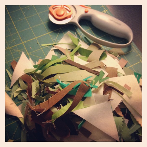
3. Start cutting (6" strips, cut into 6" squares). I started cutting at a crafty meet-up, where Rae dubbed the bundle of solids, "vestment-like."  Makes a lot of sense for a wedding canopy!

4. Sew: I divvied up the squares into factorial-like piles and started sewing. Somewhere along the way, my arithmetic went awry and as I finished -- or so I thought -- trimming the squares (down to 5 5/8"), I realized I needed about 18 more squares. At which point I grabbed some fabric, cut some squares, and sewed them together, without much thought as to the precise number of squares per color.

5. Iron for awhile. Consider vacuuming the "design floor." Get all determined and sweep and vacuum said floor. Start laying out squares. Move around as seems wise, or possibly because you step on some squares and mess up the order.


6. Maintain some semblance of order. As you may be able to see, I made myself little tags (right bottom) to keep the rows in order. For what may have been the first time ever, I did not mess up the order and need to unpick and resew. That might never ever happen again. But I think it's a strong endorsement of tagging rows in some fashion (mine are bits of fabrics with numbers written on them -- very high tech!).

7. Press seams for some time. Catch up on the season finales of NCIS, NCIS-LA, Castle, and whatever other shows you like.

8. Baste. I used a white flannel sheet as batting and a white cotton sheet as backing. I basted it over my ironing board, which I find is the best way to keep everything aligned, tight (I iron the layers as I pin baste, thereby smoothing out any wrinkles).


9. Quilt. I opted for what I like to think of as a lattice-like curved grid (a technical term to be sure). On the top I used white thread, and on the back I used white, purple, and yellow (purple and yellow being ze college colors and all).


10. Bind (in Kona Regal) and admire your handiwork. Also revel in finishing 2 weeks before the wedding and one week before your friends need the chuppah.

Enjoy watching two lovely people get married. Celebrate with them, think lovely thoughts about the ceremony (sunburn notwithstanding), take lots of pictures, play with fun filters, and wonder why capturing the gorgeous deep purple is so so hard.

Read more...

Summer in San Francisco: A Quilt

>> Sunday, May 26, 2013


The grass was wet and I needed to take pictures of the quilt. I toted it around with me as I ran errands, attended a party, and went about my weekend business. As I was returning home, I noticed this abandoned auto garage and decided to take advantage of its industrial chic driveway to take pictures. I assume everyone walking and driving by thought I was nuts (it's on the edge of a neighborhood, along a busy road, so there were plenty of people available to gawk). What you can't see, or can't see well, in this image, is the barbed wire above the "no parking" sign. Alas I forgot the towels and other means of circumventing barbed wire (you learn a lot from watching crime procedurals...Burn Notice is particularly effective for acquiring such knowledge). Ah well. Back to the quilt.


This started as low-volume play with triangles, a riff on the March weather that tacked between gray and gray. I rummaged through my scrap bin and stash and plucked out a variety of solid, almost-solid, and light prints, and cut away. The light gray, green, and blue solids became powerfully saturated (context: it matters, as we historians like to repeat, over and over and over again), but watching the whites and creams duke it out as the rows came together was equally fun.


One of the best aspects of random layouts is the fact that mistakenly sewing a row in the wrong order doesn't matter. I might have done that. Possibly twice.


The green and blue tree print (Marimekko) needed to go on the back, or rather needed to be displayed in large quantities and thus needed a spot of honor on the back. That represented one of the first decisions I made in planning this quilt. I had no idea what would join it until I needed a back and started mixing and matching options. I'm pretty sure the remnant triangles are my favorite part of the back. Until my eyes linger on the coral-orange stripe and I like it best. It's so hard to choose among awesome design elements, but handily I don't actually have to actually make a decision. I like the back a lot, that's all.


The diamond quilting--offset by what is a little more than 1/4" inch but less than 3/8" of an inch (5/16", it would seem)--pleases me greatly. Especially on the back where it stands out and looks very quilty. The binding comes from an ombre Marimekko remnant that shuffles between grey-blue and deep green. At one point I know I had a fabulous name for this quilt, but my brain has siphoned it off to somewhere presently irretrievable; as a result, I shall dub it Summer in San Francisco, for that's where it will lodge, and the colors are, in a way, quite reflective of delightfully chilly SF summers.

Read more...

A Little Spice

>> Thursday, December 27, 2012


Sometimes the closet provides the perfect upcycled wrapping. Because a warm, flannel-backed quilt might just save you 10 percent on your heating bills this winter. I finished this quilt right before I went home for Thanksgiving, and I wanted to make sure it stayed protected in transit. That, and I needed to deliver it to the person who commissioned it as a wedding gift, and I thought she'd enjoy the temporary wrapping.


I showed a few glimpses of the quilt in progress way back when I started it. As noted then, the design is based on Felicity's lovely Sea Glass on Sand, and based on her (and other feedback) I added in a couple of mulberry triangles to pop against the browns, greens, and creams. The colors, along with the seasonal scents they evoke and the occasion for the quilt, led me to dub it "A Little Spice" as I constructed it; the name stuck. The color scheme is a little different from my typical choices, but it was designed for the couple whose apartment is decorated in creams with green and brown accents. Working out of my color comfort zone pushed me to think about design, and how a quilt could sing in a more muted palette.


I love how the bright white draws the eye in as much as the greens and darker tans. The blocks were all 6" and I originally planned a 10x12 layout, I added an extra row to make it 10x13 (or 55"x71.5") as I pieced it together. The seam allowance ate up the 1/2" between rows and while I knew that would happen, I felt a need to compensate. Or at least make sure there would be room for the couple's toes. I borrowed the quilting plan from Felicity as well, using 2 interlocking curves on the diagonal -- a technique I'll certainly use again.


The quilt commission came with a request for a "soft back," and I opted for flannel. A flannel sheet from Target to be specific. The sheet is thicker than quilting flannel, so that plus a layer of batting makes for a substantial throw quilt. Using a sheet also eliminated the need to piece the back and, as it was bigger than the front, simplified basting as well. The binding is a Heather Ross print, Meadow Flowers, I picked up in the sale vault at Lake Street Mercantile about 4 years ago. Apparently I could have sold that yard for about $36 right now (admittedly, it's no goldfish), but I'm content to let aesthetic value trump financial gain. Plus, if someone had purchased it, I would have had to go to the post office between Thanksgiving and Christmas, and that surely represents a terrible use of time.

Read more...

Good & Plenty

>> Tuesday, December 4, 2012


Or Mike & Ikes, because, to be honest, I hate licorice and bubble-gum pink, which places Good & Plenty's pretty low on my candy consumption list. So low that I don't think I've tasted a Good & Plenty in decades, if not longer. But candy, delightful as it can be (when it's tasty and all), is not actually the point of this post. (Shocking, right?)


I'm really hoping that this quilt made it to its new home. I haven't heard and, as luck would have it, I sent it on its merry way to New York City two days before Sandy unleashed chaos on the region. Priority Mail, I'm guessing, did not operate quite as quickly as usual in the aftermath of a damaging storm. And I didn't put a tracking number on it because apparently I like to test fate. If nothing else, I'm recording its existence here.


I really like the quilts I make. But this one? This quilt I love. The idea popped into my head and, despite some unfortunate moments with the seam ripper, it came into being before exasperation set it. Each Good & Plenty orb uses a large rectangle plus 4 drunkard's block pieces, and I think it might be more efficient and precise to use half-circle blocks, but that's an experiment waiting in the wings. I can imagine all sorts of other color combinations and layouts with these blocks, but I do love them in solids. Some of my favorite solids to be precise -- Betty's Orange, Charcoal, a beguiling aqua whose name I don't know, Gray, and a charming yellow whose name likewise escapes me. They're either Moda Bella Solids or Kona, and the background cream is Moda Snow.


I got all fancy with the orb-quilting, using coordinating thread, a free-motion foot, and a different technique (most of which were new to me) in each color. There are pebbles. There are loops. There are squiggles. And there viney leaves. Viney leaves, people. Those were new and tricky and challenging, and I have no idea how people quilt more of the them in larger spaces on their home machines. I hear there's this thing called practice, but still, that's some hard quilting.


As has been my wont this fall, I pieced a backing from stash fabrics. A half-yard here, a whole yard there, and random pieces in between. I'm making a slight dent in the piles, and I love displaying some larger swaths. Cute as those elephants are, it's the repeat in the orange fabric that pleases me most.


As always, Good & Plenty is machine-bound. I got a little fancy here, using aqua thread on the charcoal binding for a little twist. It's only visible close-up, but it adds a little solid sparkle to the edges.

Read more...

Scattered Color Pop (Mini Tutorial Included)

>> Tuesday, November 13, 2012


There's nothing like a quilt show & sale to make quilt tops jump off the shelf and get themselves backed, quilted, and bound. I might have played a little role in this process, but the importance of deadlines in my life cannot be overstated. I made this quilt top last winter, after which I dallied finishing it. Most of my sewing projects arise with a recipient in mind, whereas this one started with an idea and no recipient, which is where the no deadline issue arose. But finished it is. And love it I do.


A few people asked me about size, fabric requirements, and the like so I'm going to provide a mini-pattern-tutorial. As half-square triangles represent the entirety of the block-making, and the layout is random, I'm really only providing some numbers and measurements. This particular version finishes at about 54" x 58.5" (12 rows, 13 columns), but it's super easy to upsize or downsize: make more (or fewer) blocks. In other words, figure out the dimensions (rows/columns), multiply, and the product = necessary HST blocks.

Supplies
1 charm pack (42 5" squares)
25" of 3 coordinating solids, cross-cut in 5" WOF strips

Cut 5" strips into 38 5" squares (if you cut all the strips, you'll have 40 squares of each solid. You could use 40 each of 2 solids and 34 of another, thus only requiring 4.5 5" strips on one color (if, say, you have solid scraps and not quite 25" of one). I think I used 42 5" squares of the off-white and khaki, and 30 of the gold, but I can't recall and I'm too lazy to count HSTs in the quilt itself. The point is: this is a versatile, flexible design. Use what you have!

Divvy up each group of squares into thirds. You should have 12 piles. As 38 does not divide evenly into 3, the groups won't be the same size. Then pair up the piles as follows (substituting whatever colors you're using): (1) charms/off-white, (2) charms/khaki, (3) charms/gold, (4) off-white/khaki, (5) off-white/gold, and (6) gold/khaki. Make sure each pile consists of full pairs. The piles with the charms should have 14 charm/solid pairs, while the solid-solid piles will vary depending on how you divided 38.

Sew squares into half-square triangles, using your preferred method. I draw a diagonal line down the center, stitch a scant 1/4" on both sides, cut on the line, and voila, 2 HSTs ready to be pressed. Trim your blocks. With 5" starting squares, I usually trim down to 4 5/8" but you might be able to eek out 4.75" or prefer to play it safe with 4.5".

Lay it out -- I start by grabbing squares randomly and then rearranging to get a reasonable distribution of color. In the end, it is not random in the mathematical sense, but visually it feels random. Sew it up. Take a break, have a drink, eat a treat, and admire your lovely quilt top.


Since this quilt is now finished, it has a back too. I pretty much adore this quilt back. It's got bright colors, birds in cages, ugly ducklings, and a slight little angle that I'll pretend was completely intentional. Totally planned. Because that's how I do it. I pulled stash prints that coordinated with the charm pack (It's a Hoot), at which point I realized it needed a red binding.


So I made one. Bright red Riley Blake circles. Works with the front and the back.

Perhaps you'd like to see this quilt in person and possibly even buy it for yourself or a loved one? If you're in SE Michigan or NW Ohio or South-Central (???) Canada (what's the Windsor, ON region called?), it will be at the Ann Arbor Modern Quilt Guild Show & Sale this Thursday (November 15) at the Corner Brewery in Ypsi, 5-9 pm. You should come. If I don't know you, I'd love to meet you. And if it doesn't sell at the show, it might make its way to a little pop-up quilt, challah cover, and clutch sale here on the blog, in the near-ish future.

Read more...

Step-by-Step

>> Tuesday, October 23, 2012


120 6.5" squares waiting to be turned into a quilt. A commissioned wedding quilt for a couple getting married in December. The instructions were wonderfully simple: come up with a quilt for a couple whose apartment has a cream/brown/green color scheme. I toyed with several ideas for the quilt, mostly thinking about wide improv pieced curves, a larger version of this challah cover in a different color scheme. But then I saw Felicity's Sea Glass on Sand quilt, I quickly formed a new plan.


I dug into my collection of solid neutrals, added a few more from my (local) quilt shop Pink Castle Fabrics, and started cutting. Moda Snow dominates, as I had some yardage of it, but the pile also includes Moda Porcelain, Kona Snow/Putty/Oyster/Parchment, Fig Tree Cream, and unlabeled neutrals from my scrap bin. I had more shades of green and fewer shades of brown than I expected (or realized). But a sufficient spread to keep the corners interesting. I considered mixing in some prints, but I like the look of all solids.

I'm still considering adding in a few punch of mulberry (shot cotton, that is). I plucked three squares from the pile before trimming so I can play with the layout and change my mind, rip out some seams, and insert a few dots of difference. I usually dread trimming and squaring blocks. But a few episodes of Dexter (I'm still on Season 5) made the work less tedious. The blocks are trimmed and ready for my design floor. Once I sweep and vacuum said floor, anyways.

p.s. In anticipation of Pink Castle Fabrics' move into a new brick and mortar space, everything in the shop is 25% off through the end of October, with the code MOVING. Depending on when you place your order, I might just get the chance to cut and package it for you.

Read more...

The Accidental Living Room Quilt

>> Thursday, October 18, 2012

Making things for myself is paralyzing. How do I decide on a design or choose fabric when I'm not going to design something I dislike or buy fabric that is unappealing? And how do I pick the perfect palette for the living room I already live in? Admittedly, the (super comfortable) gold couch is perhaps not the item I would select from a store, but free, old-in-the-best-sort-of-way, and did I mention amazingly comfortable rocks (thanks grandparents for making some great furniture purchases back in the day).

Two springs ago I was temporarily living in DC. I toted a small portion of my stash with me (sanity protection) and resolved to make stuff within the parameters of what I brought. That small stash included 2 charm packs of Kate Spain's Central Park line, and a lot of solids. I challenged myself to make a big quilt with those charm packs, and by adding a lot of solids, I succeeded.

I followed no particular format in laying out the fabric. I probably tried to avoid setting the same fabrics next to one another, making it not totally random, and I may have adjusted squares as I sewed them together. To be honest, I don't really remember how I did it all that clearly. I do recall wishing I had used green instead of yellow as the most significant solid at one point, but having already cut out  lots of yellow squares, well, no change was in the works. Unlike most of the quilts I make, this one had no intended recipient. As a result, when I finished the quilt top I had no need or incentive to finish it quickly, and it sat on a shelf for months.

Last winter I decided I needed to move this project from the unfinished pile to the finished one. I dug into my stash to find fabric to back it, and decided to use the Alexander Henry Birdsong as the primary backing. Then I added coordinating fabric to make it big enough to fit the front, quilted it 1/4" lines offset from the seams, and bound it. I washed it and wondered to whom I should give it. It sat on a chair in my living room, waiting to move on to its new home.

Summer faded into fall, and one night I wanted to burrow under a quilt while reading on the couch. Rather than dig up a blanket from the closet, I grabbed the one sitting on the chair. I wouldn't have expected the pale yellow to work with the gold couch but, in a way, it does. It's not exactly the design or colors I would have picked for my living room, but it works. The binding isn't my favorite shade of green, but it doesn't really matter. It's a lot easier to let a quilt find a home in my living room than design one specifically for it. So much less pressure, so much more pleasurable.

Read more...

  © Blogger template Autumn Leaves by Ourblogtemplates.com 2008

Back to TOP