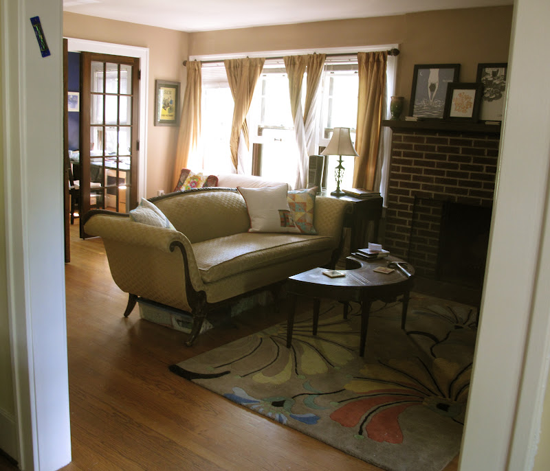
There has been a little redecorating afoot at Chez Two Hippos. Namely, the hanging of pictures and the making of new pillow covers in the living room (which also functions as my sewing space -- see back left corner). This has been a long time coming, or at least 9 months coming. There used to be cranberry trim (including all the windows) in this room. Cranberry trim is a terrible idea. Perhaps you want some deep red in your room? I highly recommend a wall.
After three years of muttering obscenities about said cranberry trim, it was time to do something about the horribleness. So, much like a Soviet dissident in the days of yore, it got disappeared last fall (I've been reading crime fiction set in mid-20th century Eastern Europe...). White trim is quite lovely. At the same time, the walls received some paint love (Olympic Park Loop, if I recall correctly) and I took the plunge and acquired (rather inexpensively, thanks to a super sale and $1 shipping) a
fun area rug. A few months later, I bought a
map. It looked good in the room, even if it sat on the floor waiting to be hung for another 5 or so months. The cranberry pillows, however, remained.
Until I returned from research this summer and couldn't stand them any more. At which point, I had to change them. Immediately. And there commenced about 16 hours of furious design and sewing, after which three new pillow covers made everything better. As I don't do matchy-matchy very well (or at all), I opted for different designs in three shades of the same palette -- bright (above), muted (below), and dark (below) -- all of which coordinate with my gold couch. Sidenote: the couch belonged to my grandparents' and it is the world's most comfortable couch. Back to making things...the design above was inspired by
Rebecca's pillow. I think if I were making it again, I'd use a solid white instead of the Echo print, since it's a little busy for my taste, but it works. And since I used scraps of some of my favorite prints, I get to see some of my favorite prints all the time. Win.
Originally I planned to make the HST pillow (on right) with solids, but when I laid out the solids, they weren't speaking to me. Or they were, and they were saying "don't use me." Which was great because I got to dig into some stashed favorites, including the orange
Heirloom Tile and the yellow and gray prints from Dena Designs'
Taza collection. The improv pillow (left) is definitely my favorite: solids + negative space + circle quilting = awesome. I admire those who circle-quilt much larger pieces because, damn it takes a lot of time and focus.
There's something about this picture line-up of pillow backs that makes me chuckle. They're all envelope closures, though a touch different at the overlap point (broad band of contrasting fabric, no contrast, and thin band of binding). Here too, I dipped into some stash favorites (for the fabric followers -- Nicey Jane + Park Slope (L), Central Park (M), and Max & Whiskers (R)). So there you have it: a much-aesthetically-improved living room.
Read more...


 Robin:
 Another recent D*S find -- no birds, but luscious, rich city and alphabet prints from JHill Design. It looks like Bostonians can see the prints in person at the South End Open Market.


